绘图基础#
chemotools.plotting 模块旨在使光谱数据和化学计量学模型的可视化变得**快速**、直观**且**达到发表质量。无需编写样板式的 matplotlib 代码,仅用几行即可生成标准的化学计量学图表。
警告
该绘图模块是实验性的,且正在积极开发中。其API可能在未来的版本中发生变化。我们欢迎您的反馈!请在此处报告问题或建议:paucablop/chemotools#issues
为什么需要专门的绘图工具?#
可视化高维光谱数据和化学计量学模型通常需要重复且冗长的绘图代码。chemotools 通过提供以下功能来简化这一过程:
领域专用图表:开箱即用的光谱图、得分图、载荷图和异常值图。
交互式探索:用于即时反馈的快速
show()方法。发表质量:干净、标准化的美学设计,适合用于论文。
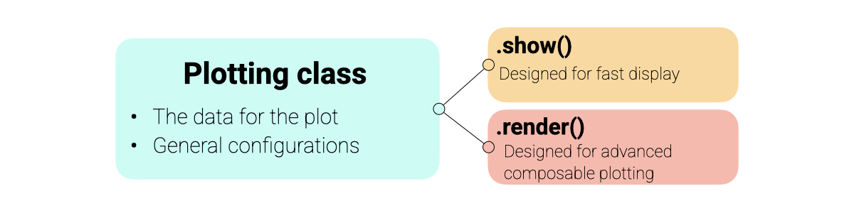
设计理念#
绘图模块围绕一个一致的**显示协议(Display Protocol)**构建,旨在平衡易用性与灵活性。
面向对象:每种图表类型(例如,
SpectraPlot、ScoresPlot)都是一个保存数据和配置的类。两种操作模式:
show():即时创建一个新图形。非常适合快速探索。render(ax):将图表绘制到现有的matplotlib坐标轴上。专为构建高级、多面板图形和仪表板而设计。
Matplotlib集成:所有图表都返回标准的
matplotlib.axes.Axes对象,允许您使用熟悉的matplotlib命令添加自定义注释、线条或样式。
绘图架构概述如下:
备注
由于 chemotools 绘图建立在 matplotlib 之上,您可以使用所有喜欢的 matplotlib 命令来进一步自定义 render() 或 show() 返回的图表。
可视化光谱#
SpectraPlot 是您进行探索性数据分析的主要工具。它提供了灵活的方式来可视化您的光谱数据。
在此示例中,我们将使用来自 chemotools 的发酵数据集。
from chemotools.datasets import load_fermentation_train
from chemotools.feature_selection import RangeCut

import numpy as np

# Load data
X, Y = load_fermentation_train()
wavenumbers = X.columns.values
y = Y["glucose"]
X = X.values

# Measuring date
measuring_date = np.array(["2023-01-01"] * 10 + ["2023-01-02"] * 11)
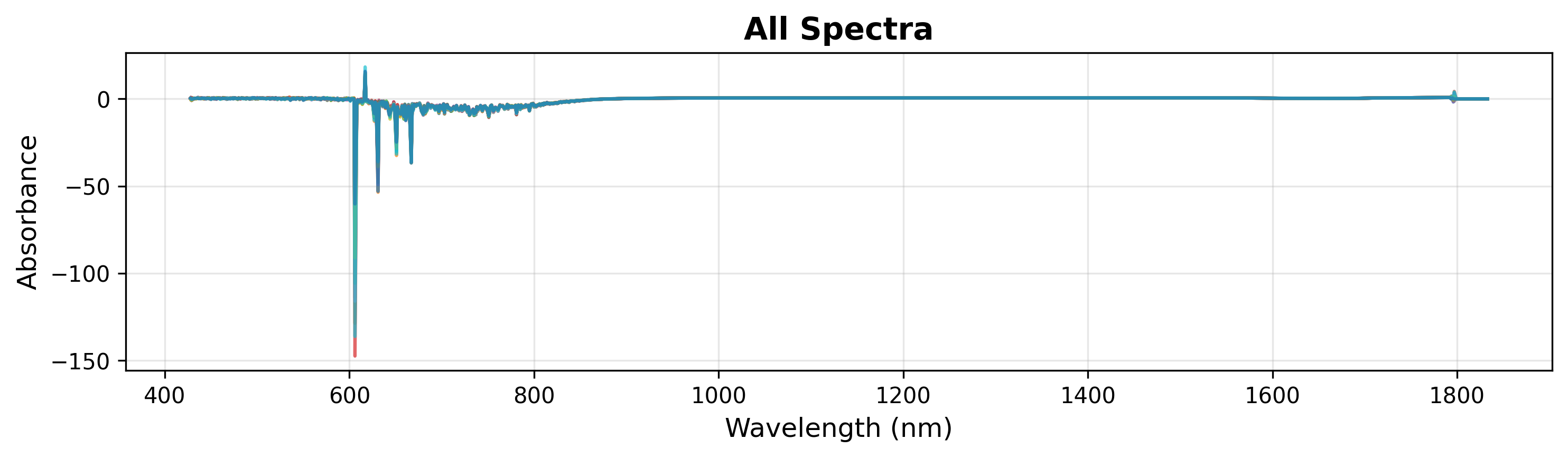
1. 快速可视化
要快速检查您的数据,只需传入波数和光谱矩阵。这将以单一颜色绘制所有光谱。
# Create plot object
plot = SpectraPlot(x=wavenumbers, y=X)

# Display it
fig = plot.show(title="All Spectra", ylabel="Absorbance")
在探索过程中,您可能希望检查光谱的特定区域。您可以通过在 show() 方法中指定 xlim 来实现(见下文)。
# Display it
fig = plot.show(title="All Spectra", ylabel="Absorbance", xlim=(900, 1500))
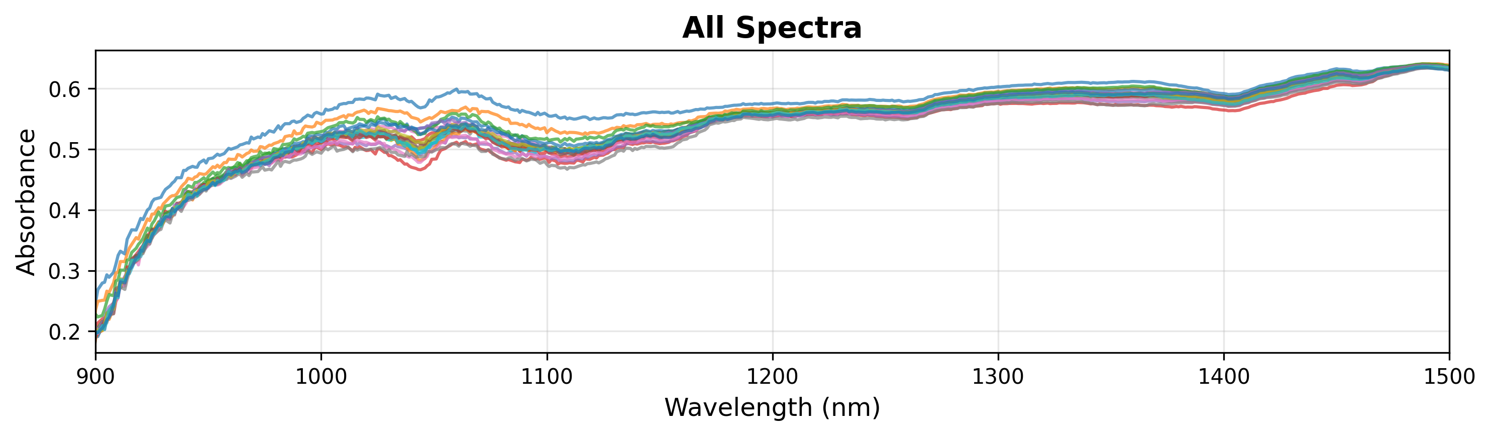
备注
SpectraPlot 会根据数据范围自动处理y轴缩放。您也可以手动设置 ylim 以聚焦于特定特征。
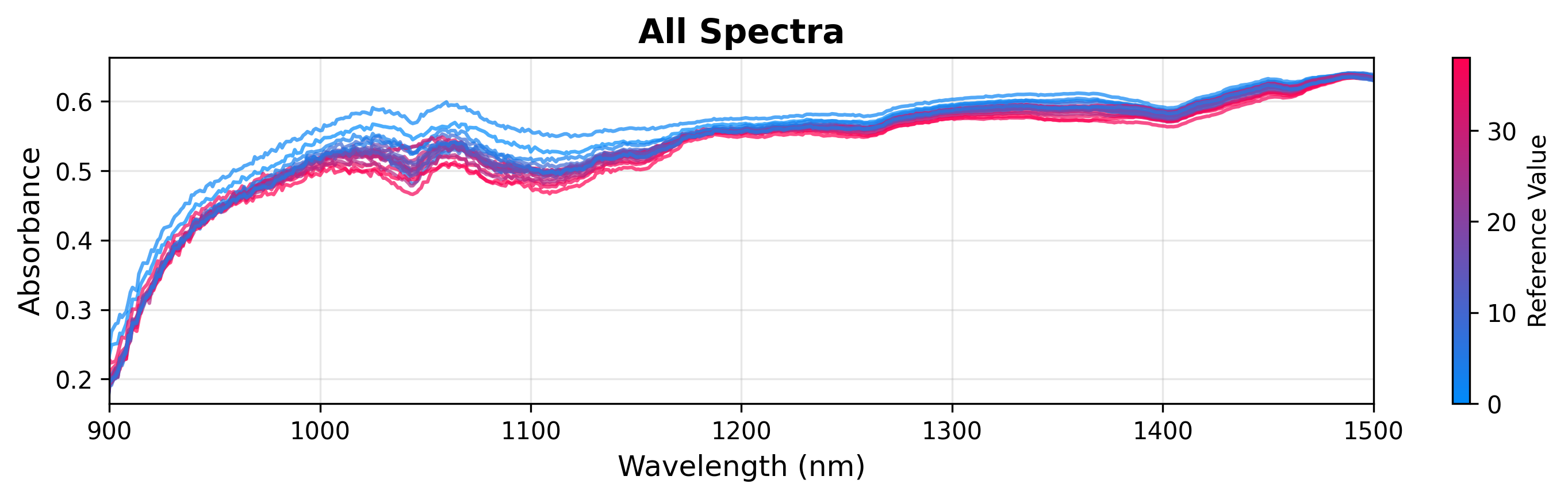
2. 按连续变量着色
您可以根据连续目标变量(如葡萄糖浓度)为光谱着色,以可视化相关性。
# Create plot object
plot = SpectraPlot(x=wavenumbers, y=X, color_by=y)

# Display it
fig = plot.show(title="All Spectra", ylabel="Absorbance", xlim=(900, 1500))
3. 按分类变量着色
如果您有分类数据(例如,批次、实验条件),可以按组着色。
# Create plot object
plot = SpectraPlot(x=wavenumbers, y=X, color_by=measuring_date, color_mode="categorical")

# Display it
fig = plot.show(title="All Spectra", ylabel="Absorbance", xlim=(900, 1500))

分析模型#
拟合化学计量学模型(如PCA或PLS)后,可视化结果对于解释至关重要。在本节中,我们将使用一个基于 chemotools 发酵数据拟合的简单PCA模型。
from sklearn.decomposition import PCA
import matplotlib.pyplot as plt

# Fit a PCA model
pca = PCA(n_components=3)
scores = pca.fit_transform(X)
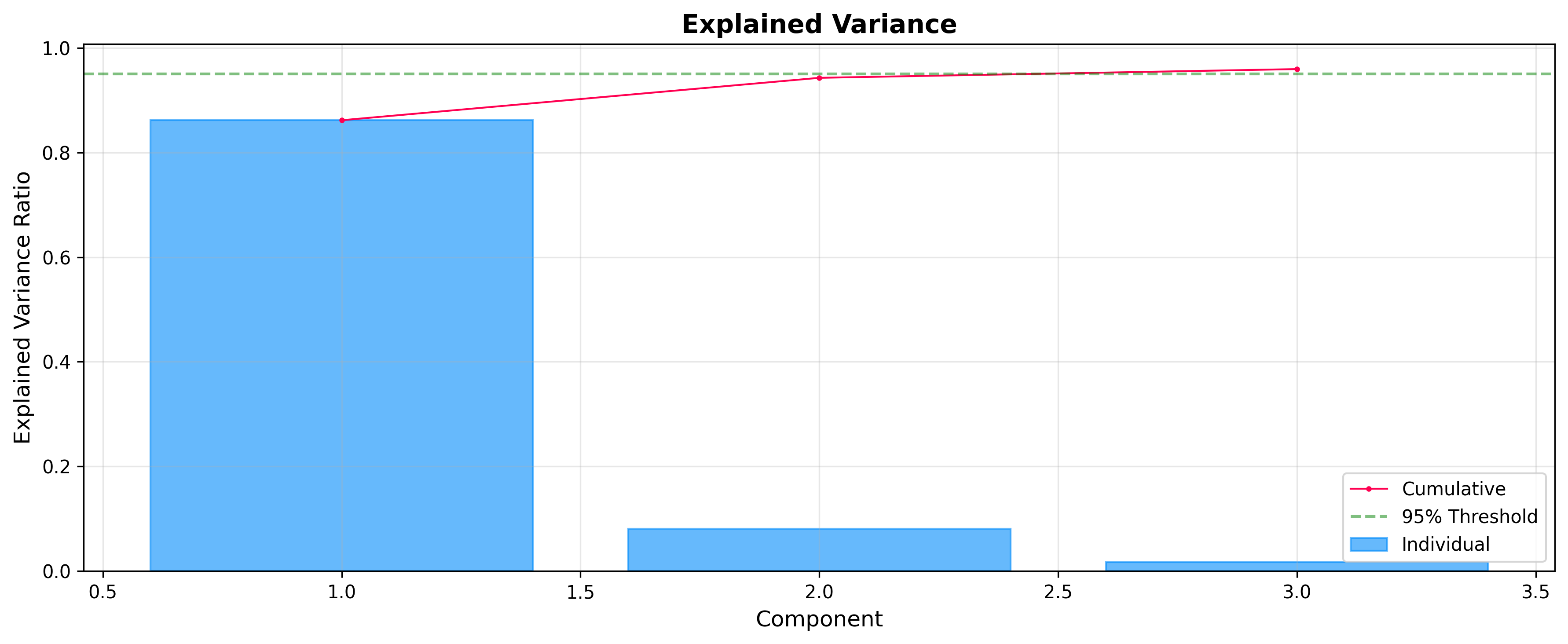
解释方差:选择成分
在分析得分和载荷之前,检查每个成分解释了多少方差通常很有用。ExplainedVariancePlot 帮助您决定最佳成分数量。
from chemotools.plotting import ExplainedVariancePlot

# Plot explained variance ratio
plot = ExplainedVariancePlot(pca.explained_variance_ratio_)
fig = plot.show(title="Explained Variance")
得分:样本空间
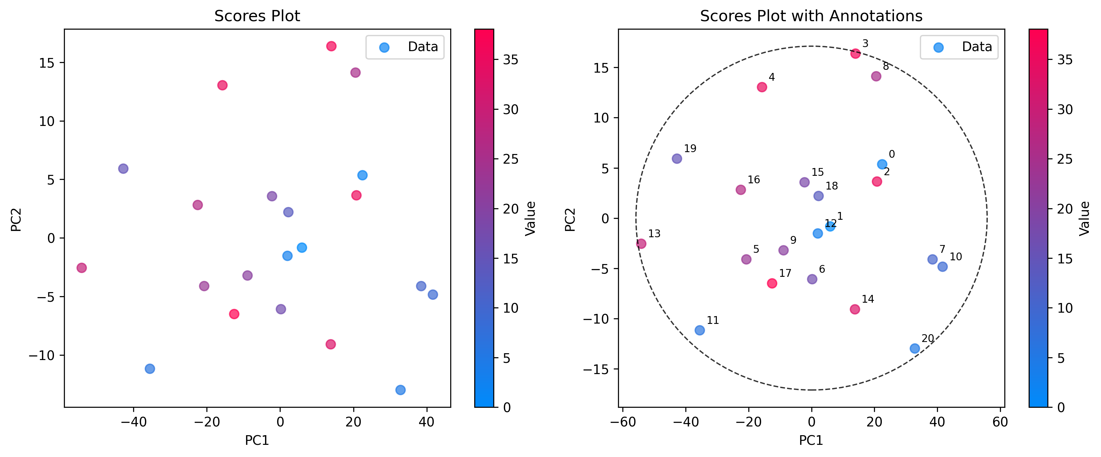
使用 ScoresPlot 可视化样本之间的相互关系。这对于识别聚类、趋势或异常值至关重要。ScoresPlot 高度灵活,可用于创建复合图形以显示模型的不同方面,例如置信椭圆和样本注释。
from chemotools.plotting import ScoresPlot


fig, ax = plt.subplots(1, 2, figsize=(12, 5))

# 1. Simple2D scores plot colored by glucose concentration
plot = ScoresPlot(scores, components=(0, 1), color_by=y)
plot.render(ax=ax[0])
ax[0].set_title("Scores Plot")

# 2. Advanced scores plot with confidence ellipse and annotations
sample_names = [f"{i}" for i in range(len(scores))]
plot = ScoresPlot(
    scores,
    confidence_ellipse=0.9,
    annotations=sample_names,
    components=(0, 1),
    color_by=y,
)
plot.render(ax=ax[1])
ax[1].set_title("Scores Plot with Annotations")
备注
由于我们将两个图表组合到一个图形中,我们使用 render(ax=...) 方法将每个图表绘制到特定的坐标轴上。这样可以精确控制布局和样式。
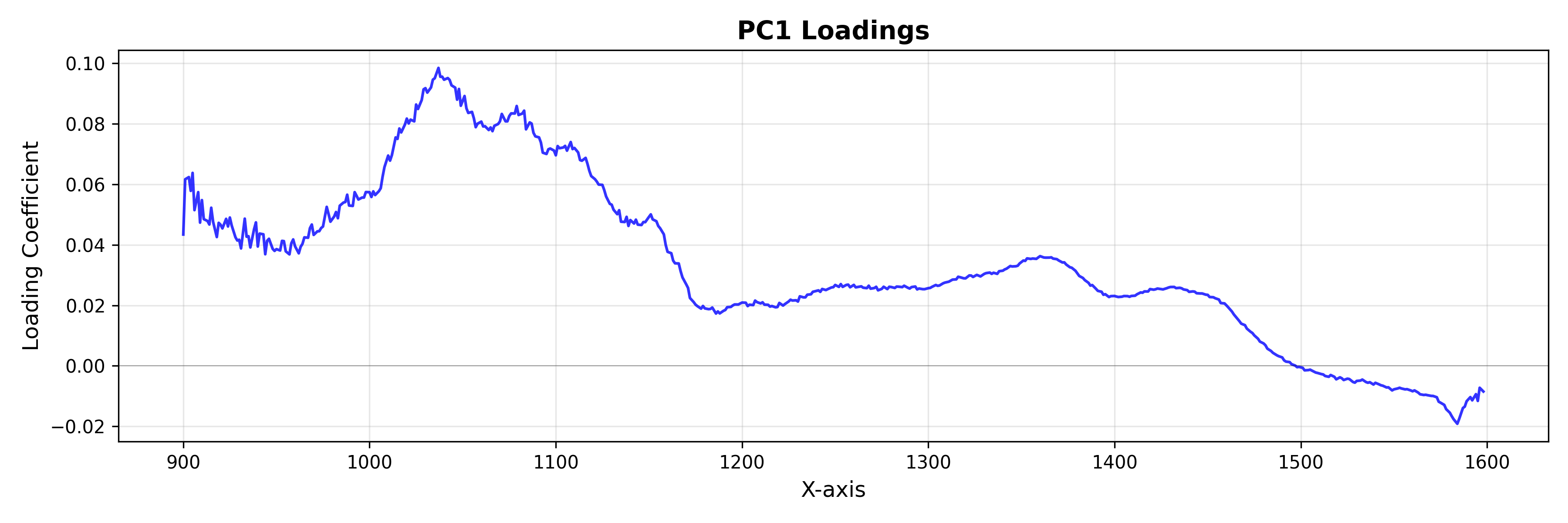
载荷:特征空间
使用 LoadingsPlot 来理解哪些光谱特征对模型的贡献最大。
from chemotools.plotting import LoadingsPlot

loadings = pca.components_.T

# Plot loadings for the first component
plot = LoadingsPlot(loadings, feature_names=wavenumbers, components=0)
fig = plot.show(title="PC1 Loadings", ylabel="Loading Coefficient")
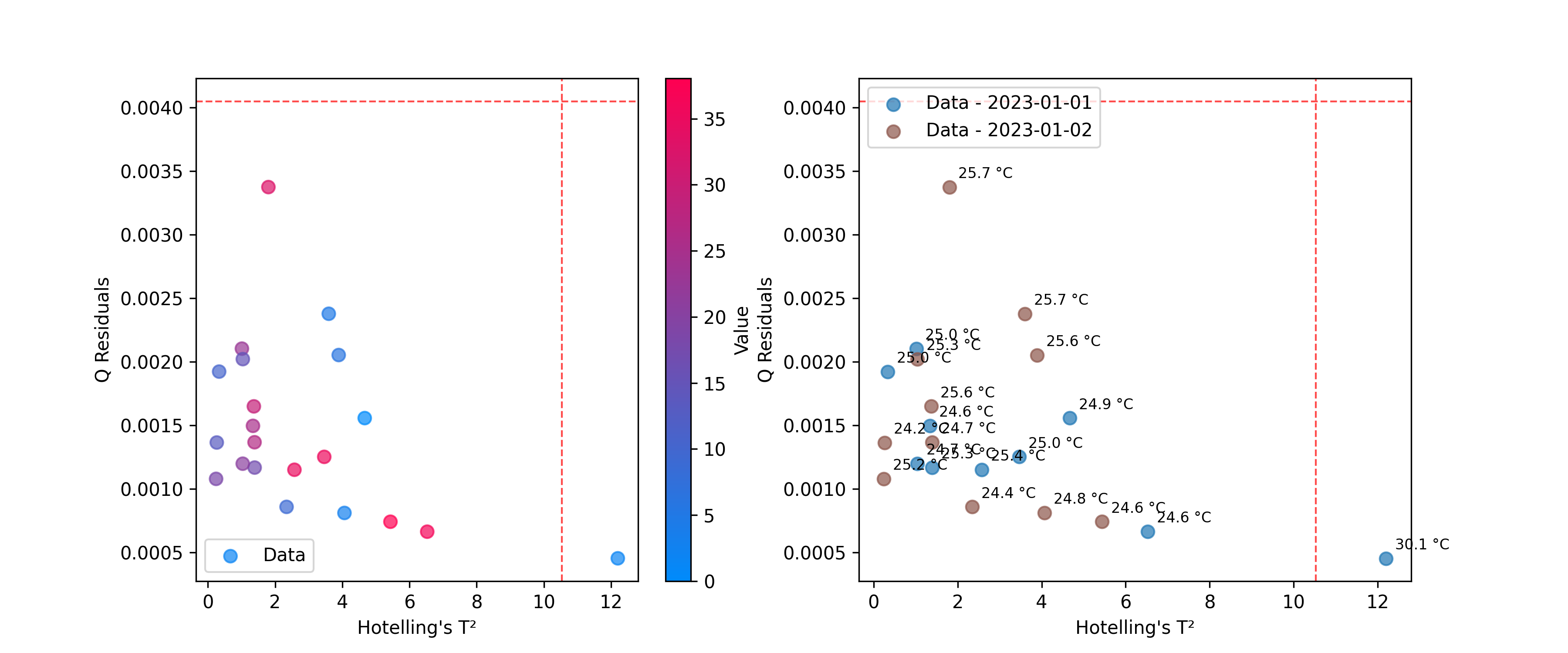
异常值检测
使用 DistancesPlot 来识别与模型拟合不佳的样本,使用诸如Hotelling's T²和Q残差等指标。有关计算这些统计量的更多详细信息,请参见 异常值检测。
from chemotools.outliers import HotellingT2, QResiduals

# Calculate outlier statistics
hotelling = HotellingT2(pca).fit(X)
q_residuals = QResiduals(pca).fit(X)
现在,我们准备可视化结果。
from chemotools.plotting import DistancesPlot

# Plot T² vs Q-residuals
plot = DistancesPlot(
    x=hotelling.predict_residuals(X_cut),
    y=q_residuals.predict_residuals(X_cut),
    confidence_lines=(hotelling.critical_value_, q_residuals.critical_value_),
    color_by=y,
).render(ax=ax[0],xlabel="Hotelling's T²", ylabel="Q Residuals")

plot = DistancesPlot(
    x=hotelling.predict_residuals(X_cut),
    y=q_residuals.predict_residuals(X_cut),
    confidence_lines=(hotelling.critical_value_, q_residuals.critical_value_),
    color_by=measuring_date,
    annotations=temperatures,
).render(ax=ax[1],xlabel="Hotelling's T²", ylabel="Q Residuals")
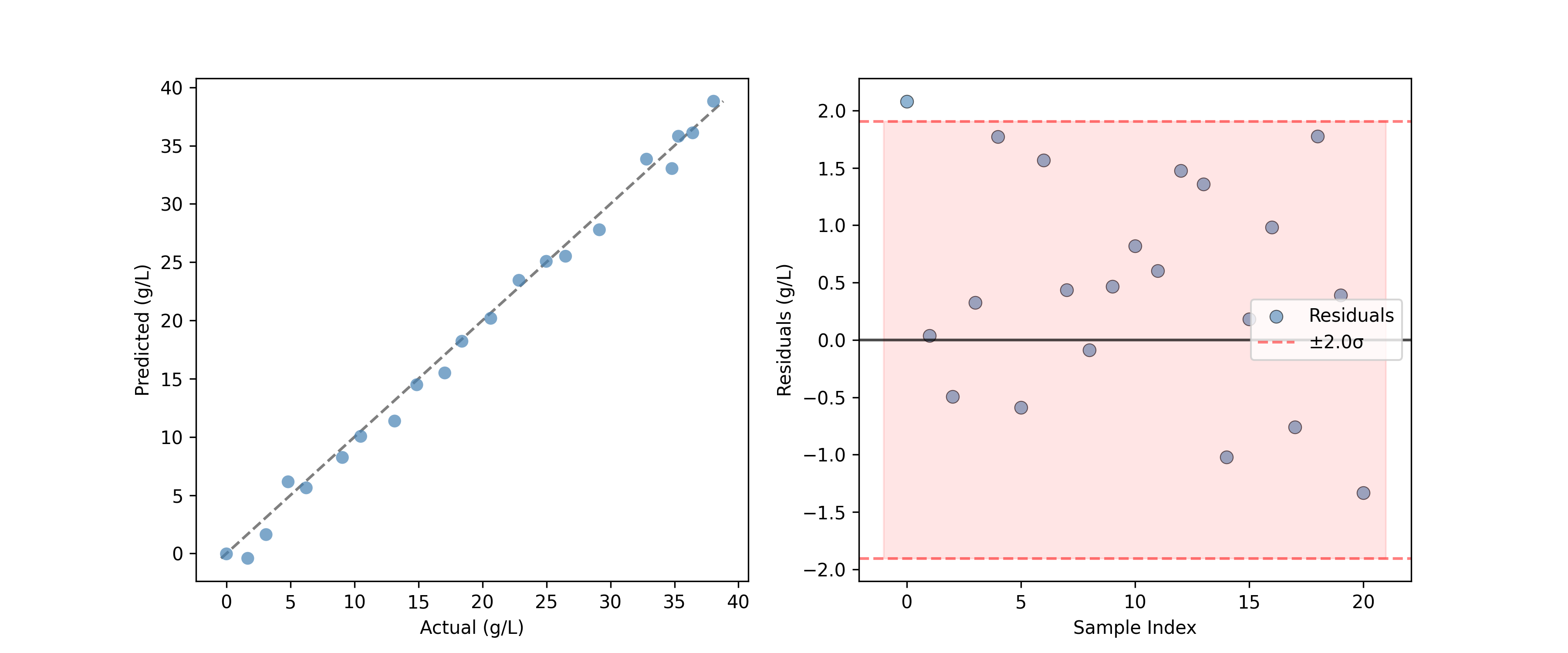
评估预测#
对于回归模型,PredictedVsActualPlot 提供了一种评估模型性能的标准方法。
from chemotools.plotting import PredictedVsActualPlot, YResidualsPlot
y_residuals = y_test - y_pred

# Assume y_pred comes from a PLS model
fig, ax = plt.subplots(1, 2, figsize=(12, 5))
PredictedVsActualPlot(y_true=y_test, y_pred=y_pred).render(
    ax=ax[0], xlabel="Actual (g/L)", ylabel="Predicted (g/L)"
)
YResidualsPlot(residuals=y_residuals, add_confidence_band=True).render(
    ax=ax[1], xlabel="Sample Index", ylabel="Residuals (g/L)"
)
创建复合图形#
所有绘图类都支持 render(ax=...) 方法,允许您将图表放置在现有的matplotlib坐标轴上。这对于创建仪表板或对比图形非常强大。
import matplotlib.pyplot as plt

# Create a figure with 2 subplots
fig, (ax1, ax2) = plt.subplots(1, 2, figsize=(12, 5))

# Plot 1: All spectra
SpectraPlot(x=wavenumbers, y=X, color='lightgray').render(ax1)
ax1.set_title("Raw Spectra")

# Plot 2: Mean spectrum
SpectraPlot(x=wavenumbers, y=X.mean(axis=0), color='black').render(ax2)
ax2.set_title("Mean Spectrum")

plt.tight_layout()
plt.show()
其他可用图表#
chemotools.plotting 模块包含本指南未涵盖的其他专业图表:
FeatureSelectionPlot:可视化特征重要性和选择结果。QQPlot:检查残差的正态性。ResidualDistributionPlot:分析模型残差的分布。YResidualsPlot:绘制残差与预测值的图表。
查看API参考以获取有关这些类的更多详细信息。