使用 PLS 进行葡萄糖监测#
💡注意: 本文档是一个 Jupyter 笔记本。您可以下载源文件并在您的 Jupyter 环境中运行!
引言#
该数据集通过使用衰减全反射中红外光谱(ATR-MIR)收集的光谱数据以及使用高效液相色谱(HPLC)进行验证的参考测量,提供了关于木质纤维素乙醇发酵的信息。
该项目包含两个数据集:
训练数据集: 包含带有相应 HPLC 测量的光谱数据,用于训练偏最小二乘(PLS)模型。
测试数据集: 包含发酵过程中收集的光谱时间序列,以及离线 HPLC 测量。
有关这些数据集以及如何使用它们来监测发酵的更多信息,请参阅我们的文章:”将数据转化为信息:木质纤维素乙醇发酵中实时状态估计的并行混合模型”(请注意,文章中的数据与此处提供的数据不同)。
目标#
在本练习中,您将构建一个 PLS 模型,使用 ATR-MIR 光谱实时监测葡萄糖浓度。您将使用一个小的加标光谱训练集来训练模型,然后使用实际发酵过程中的光谱测试其性能。
开始之前#
在开始之前,您需要确保已安装以下依赖项:
chemotools
matplotlib
numpy
pandas
scikit-learn
您可以使用以下命令安装它们
pip install chemotools
pip install matplotlib
pip install numpy
pip install pandas
pip install scikit-learn
加载训练数据#
您可以从 chemotools.datasets 模块中使用 load_fermentation_train() 函数访问。
[ ]:
from chemotools.datasets import load_fermentation_train

spectra, hplc = load_fermentation_train()
load_fermentation_train() 函数返回两个 pandas.DataFrame:
spectra:此数据框包含光谱数据,列代表波数,行代表样本。hplc:在这里,您将找到每个样本葡萄糖浓度(以 g/L 为单位)的参考 HPLC 测量值,存储在名为glucose的单个列中。
💡注意: 如果您有兴趣使用
polars.DataFrame,您可以简单地使用load_fermentation_train(set_output="polars")。请注意,如果您选择使用polars.DataFrame,波数以str形式在列名中给出,而不是float。这是因为polars不支持str以外的类型的列名。要从polars.DataFrame中提取波数作为float,您可以使用df.columns.to_numpy(dtype=np.float64)方法。
探索训练数据#
在开始数据建模之前,熟悉您的数据很重要。让我们从回答一些基本问题开始:
有多少个样本?
有多少个可用的波数?
[ ]:
print(f"Number of samples: {spectra.shape[0]}")
print(f"Number of wavenumbers: {spectra.shape[1]}")
Number of samples: 21
Number of wavenumbers: 1047
既然我们已经掌握了基础知识,让我们更仔细地看看数据。
对于光谱数据,您可以使用 pandas.DataFrame.head() 方法检查前 5 行:
[ ]:
spectra.head()
| 428.0 | 429.0 | 431.0 | 432.0 | 434.0 | 436.0 | 437.0 | 439.0 | 440.0 | 442.0 | ... | 1821.0 | 1823.0 | 1824.0 | 1825.0 | 1826.0 | 1828.0 | 1829.0 | 1830.0 | 1831.0 | 1833.0 | |
|---|---|---|---|---|---|---|---|---|---|---|---|---|---|---|---|---|---|---|---|---|---|
| 0 | 0.493506 | -0.383721 | 0.356846 | 0.205714 | 0.217082 | 0.740331 | 0.581749 | 0.106719 | 0.507973 | 0.298643 | ... | 0 | 0 | 0 | 0 | 0 | 0 | 0 | 0 | 0 | 0 |
| 1 | 0.108225 | 0.488372 | -0.037344 | 0.448571 | 0.338078 | 0.632597 | 0.368821 | 0.462451 | 0.530752 | 0.221719 | ... | 0 | 0 | 0 | 0 | 0 | 0 | 0 | 0 | 0 | 0 |
| 2 | 0.095238 | 0.790698 | 0.174274 | 0.314286 | 0.106762 | 0.560773 | 0.182510 | 0.482213 | 0.482916 | 0.341629 | ... | 0 | 0 | 0 | 0 | 0 | 0 | 0 | 0 | 0 | 0 |
| 3 | 0.666667 | 0.197674 | 0.352697 | 0.385714 | 0.405694 | 0.508287 | 0.463878 | 0.430830 | 0.455581 | 0.527149 | ... | 0 | 0 | 0 | 0 | 0 | 0 | 0 | 0 | 0 | 0 |
| 4 | 0.532468 | -0.255814 | 0.078838 | 0.057143 | 0.238434 | 0.997238 | 0.399240 | 0.201581 | 0.533030 | 0.246606 | ... | 0 | 0 | 0 | 0 | 0 | 0 | 0 | 0 | 0 | 0 |
5 rows × 1047 columns
为简洁起见,我们不会在此显示整个表格,但您会注意到每列对应一个波数,每行代表一个样本。
转向 HPLC 数据,pandas.DataFrame.describe() 方法提供了葡萄糖列的摘要:
[ ]:
hplc.describe()
| glucose | |
|---|---|
| count | 21.000000 |
| mean | 19.063895 |
| std | 12.431570 |
| min | 0.000000 |
| 25% | 9.057189 |
| 50% | 18.395220 |
| 75% | 29.135105 |
| max | 38.053004 |
此摘要提供了对葡萄糖浓度分布的见解。有了这些实用知识,我们现在准备继续我们的数据建模之旅。
可视化训练数据#
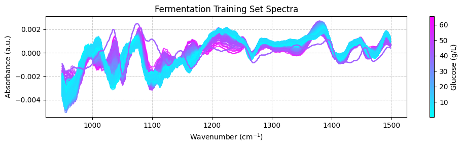
为了更好地理解我们的数据集,我们将可视化数据。我们将绘制训练数据集中的光谱,每个光谱根据其相关的葡萄糖浓度进行颜色编码。这种视觉方法提供了一种教学手段来理解数据集的特性,提供对样本间化学变化的见解。为此,我们将使用 matplotlib.pyplot 模块。请记住首先使用以下命令安装它:
pip install matplotlib
到目前为止,我们使用 pandas.DataFrame 来表示数据集。pandas.DataFrame 非常适合存储和操作许多大型数据集。然而,我经常发现使用 numpy.ndarray 处理光谱数据更方便。因此,我们将使用 pandas.DataFrame.to_numpy() 方法将 pandas.DataFrame 转换为 numpy.ndarray。
所以我们的第一步是将我们的 pandas.DataFrame 转换为 numpy.ndarray:
[ ]:
import numpy as np

# Convert the spectra pandas.DataFrame to numpy.ndarray
spectra_np = spectra.to_numpy()

# Convert the wavenumbers pandas.columns to numpy.ndarray
wavenumbers = spectra.columns.to_numpy(dtype=np.float64)

# Convert the hplc pandas.DataFrame to numpy.ndarray
hplc_np = hplc.to_numpy()
在绘制数据之前,我们将创建一个专用的绘图函数,根据葡萄糖浓度对每个光谱进行颜色编码。这种方法有助于可视化光谱模式与葡萄糖水平之间的关系。
该函数将实现:
颜色归一化:我们将使用
matplotlib.colors.Normalize将葡萄糖浓度值缩放到 0-1 范围,使其适合颜色映射。颜色映射:归一化的值将通过
matplotlib.cm.ScalarMappable使用颜色映射映射到颜色。颜色条:我们将添加一个颜色条来指示颜色如何对应葡萄糖浓度值。
这种可视化使我们能够基于相关的葡萄糖浓度比较多个光谱。
[ ]:
import matplotlib.pyplot as plt
import numpy as np
from matplotlib.colors import Normalize


def plot_spectra(
    spectra: np.ndarray, wavenumbers: np.ndarray, hplc: np.ndarray, zoom_in=False
):
    """
    Plot spectra with colors based on glucose concentration.

    Parameters:
    -----------
    spectra : np.ndarray
        Array containing spectral data, where each row is a spectrum
    wavenumbers : np.ndarray
        Array of wavenumbers (x-axis values)
    hplc : np.ndarray
        Array of glucose concentrations corresponding to each spectrum
    zoom_in : bool, default=False
        If True, zooms into a specific region of interest (950-1550 cm⁻¹)

    Returns:
    --------
    None
        Displays the plot
    """
    # Create figure and axis
    fig, ax = plt.subplots(figsize=(10, 3))

    # Set up color mapping
    cmap = plt.get_cmap("cool")  # Cool colormap (purple to blue)
    normalize = Normalize(vmin=hplc.min(), vmax=hplc.max())

    # Plot each spectrum with appropriate color
    for i, spectrum in enumerate(spectra):
        color = cmap(normalize(hplc[i]))
        ax.plot(wavenumbers, spectrum, color=color, linewidth=1.5, alpha=0.8)

    # Add colorbar to show glucose concentration scale
    sm = plt.cm.ScalarMappable(cmap=cmap, norm=normalize)
    sm.set_array([])
    fig.colorbar(sm, ax=ax, label="Glucose (g/L)")

    # Set axis labels and title
    ax.set_xlabel("Wavenumber (cm$^{-1}$)")
    ax.set_ylabel("Absorbance (a.u.)")
    ax.set_title("Fermentation Training Set Spectra")

    # Apply zoom if requested
    if zoom_in:
        ax.set_xlim(950, 1550)
        ax.set_ylim(0.45, 0.65)
        ax.set_title("Fermentation Training Set Spectra (Zoomed Region)")

    # Improve appearance
    ax.grid(True, linestyle="--", alpha=0.6)
    fig.tight_layout()

    # Show the plot
    plt.show()
我们现在可以使用此函数绘制训练数据集:
[ ]:
plot_spectra(spectra_np, wavenumbers, hplc_np)
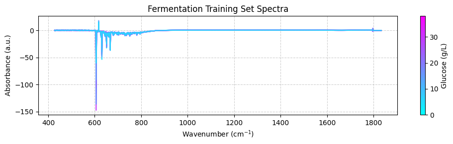
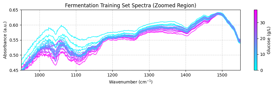
这些光谱可能看起来不清楚,因为它们覆盖了广泛的波数范围,包括化学信息很少的区域。为了获得更好的视图,我们应该专注于 950 到 1550 cm-1 之间的”指纹”区域,重要的化学特征出现在这里。目前,我们将在 plot_spectra() 函数中使用 zoom_in=True 参数来聚焦此区域。稍后,我们将学习如何使用预处理函数正确修剪光谱。
[ ]:
plot_spectra(spectra_np, wavenumbers, hplc_np, zoom_in=True)
预处理训练数据#
既然您已经探索了数据集,是时候预处理光谱数据了。此步骤对于去除不需要的变异(如基线漂移和噪声)至关重要,这些变异可能对模型性能产生负面影响。我们将使用 chemotools 和 scikit-learn 模块来预处理光谱数据。
我们将使用以下步骤预处理光谱:
范围截取:去除 950 到 1550 cm-1 范围之外的波数。
线性校正:去除线性基线漂移。
Savitzky-Golay:使用 Savitzky-Golay 方法计算光谱的 n 阶导数。这对于去除加性和乘性散射效应很有用。
标准缩放器:将光谱缩放到零均值。
我们将使用 scikit-learn 中的 `make_pipeline() <https://scikit-learn.org/stable/modules/generated/sklearn.pipeline.make_pipeline.html>`__ 函数链接预处理步骤。
💡 注意: 什么是管道? 管道是按特定顺序执行的一系列步骤。在我们的案例中,我们将创建一个管道,该管道将按上述顺序执行预处理步骤。您可以在我们的 文档页面 上找到有关使用管道的更多信息。
[ ]:
from sklearn.pipeline import make_pipeline
from sklearn.preprocessing import StandardScaler

from chemotools.baseline import LinearCorrection
from chemotools.derivative import SavitzkyGolay
from chemotools.feature_selection import RangeCut

# create a pipeline that scales the data
preprocessing = make_pipeline(
    RangeCut(start=950, end=1500, wavenumbers=wavenumbers),
    LinearCorrection(),
    SavitzkyGolay(window_size=15, polynomial_order=2, derivate_order=1),
    StandardScaler(with_std=False),
)
现在我们可以使用预处理管道来预处理光谱:
[ ]:
spectra_preprocessed = preprocessing.fit_transform(spectra_np)
我们可以使用 plot_spectra() 函数绘制预处理后的光谱:
[ ]:
# get the wavenumbers after the range cut
wavenumbers_cut = preprocessing.named_steps["rangecut"].wavenumbers_


# plot the preprocessed spectra
plot_spectra(spectra_preprocessed, wavenumbers_cut, hplc_np)
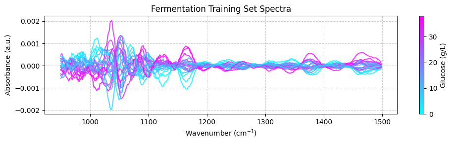
💡 注意: 这很酷!看到我们如何将化学计量学与 scikit-learn 集成吗?
RangeCut、LinearCorrection和SavitizkyGolay都是在chemotools中实现的预处理技术,而StandardScaler和pipelines是scikit-learn提供的功能。这就是chemotools的力量——它被设计为与scikit-learn无缝协作。
训练 PLS 模型#
偏最小二乘(PLS)是一种强大的回归技术,常用于化学计量学。它通过找到与目标变量协方差最大的潜在空间表示来工作。
PLS 建模中的一个关键参数是潜在空间中的组件数量(维度):
组件过多会导致过拟合,模型捕获的是噪声而不是信号
组件过少会导致欠拟合,错过数据中的重要模式
当使用有限样本时,交叉验证提供了一种可靠的方法来选择最佳组件数量。这种方法:
将数据分为训练集和验证集
在训练集上训练模型并在验证集上评估它
使用不同的数据分割重复此过程
平均结果以估计模型的泛化误差
对于我们的分析,我们将使用 scikit-learn 的 GridSearchCV 类通过交叉验证系统地测试不同的组件数量。这将基于多个数据分割的性能指标确定我们 PLS 模型的最佳复杂度。
[ ]:
# import the PLSRegression and GridSearchCV classes
from sklearn.cross_decomposition import PLSRegression
from sklearn.model_selection import GridSearchCV

# instanciate a PLSRegression object
pls = PLSRegression(scale=False)

# define the parameter grid (number of components to evaluate)
param_grid = {"n_components": [1, 2, 3, 4, 5, 6, 7, 8, 9, 10]}

# create a grid search object
grid_search = GridSearchCV(pls, param_grid, cv=10, scoring="neg_mean_absolute_error")

# fit the grid search object to the data
grid_search.fit(spectra_preprocessed, hplc_np)

# print the best parameters and score
print("Best parameters: ", grid_search.best_params_)
print("Best score: ", np.abs(grid_search.best_score_))
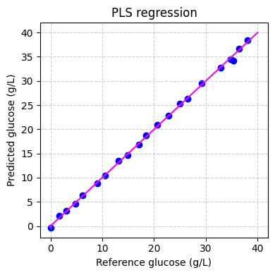
Best parameters:  {'n_components': 6}
Best score:  0.922944026246299
表明最佳组件数量为 6,平均绝对误差为 0.92 g/L。我们可以通过绘制平均绝对误差作为组件数量的函数来验证这一点:
[ ]:
fig, ax = plt.subplots(figsize=(10, 3))
ax.plot(
    param_grid["n_components"],
    np.abs(grid_search.cv_results_["mean_test_score"]),
    marker="o",
    color="b",
)
ax.set_xlabel("Number of components")
ax.set_ylabel("Mean absolute error (g/L)")
ax.set_title("Cross validation results")
ax.grid(True, linestyle="--", alpha=0.6)
fig.tight_layout()
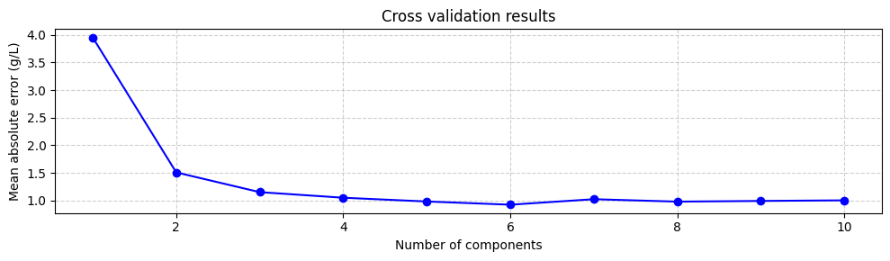
尽管使用最小化平均绝对误差的组件数量是一个好的起点,但并不总是最好的。与具有 3 个甚至 2 个组件的模型相比,具有 6 个组件的模型不会显著增加平均绝对误差。然而,具有 6 个组件的模型包括与较小特征值相关的组件,这些组件更不确定。这意味着具有 3 个或 2 个组件的模型可能更稳健。因此,尝试不同数量的组件并选择性能最好的那个总是一个好主意。但是,目前我们将使用 6 个组件训练模型:
[ ]:
# instanciate a PLSRegression object with 6 components
pls = PLSRegression(n_components=6, scale=False)

# fit the model to the data
pls.fit(spectra_preprocessed, hplc_np)
PLSRegression(n_components=6, scale=False)In a Jupyter environment, please rerun this cell to show the HTML representation or trust the notebook.
On GitHub, the HTML representation is unable to render, please try loading this page with nbviewer.org.
PLSRegression(n_components=6, scale=False)
最后我们可以在训练集上评估模型的性能:
[ ]:
# predict the glucose concentrations
hplc_pred = pls.predict(spectra_preprocessed)

# plot the predictions
fig, ax = plt.subplots(figsize=(4, 4))
ax.scatter(hplc_np, hplc_pred, color="blue")
ax.plot([0, 40], [0, 40], color="magenta")
ax.set_xlabel("Reference glucose (g/L)")
ax.set_ylabel("Predicted glucose (g/L)")
ax.set_title("PLS regression")
ax.grid(True, linestyle="--", alpha=0.6)
fig.tight_layout()
plt.show()
应用模型#
既然我们已经训练了模型,我们可以将其应用于测试数据集。测试数据集包含发酵过程中实时记录的光谱。测试数据集包含两个 pandas.DataFrame:
spectra:此数据集包含光谱数据,列代表波数,行代表样本。这些光谱在发酵过程中大约每 1.5 分钟实时记录一次。hplc:此数据集包含 HPLC 测量值,特别是葡萄糖浓度(以 g/L 为单位),存储在名为glucose的单个列中。这些测量值大约每 60 分钟离线记录一次。
我们将使用 chemotools.datasets 模块中的 load_fermentation_test() 函数加载测试数据集:
[ ]:
from chemotools.datasets import load_fermentation_test

spectra_test, hplc_test = load_fermentation_test()
然后,我们将使用与训练数据集相同的预处理管道来预处理光谱:
[ ]:
# convert the spectra pandas.DataFrame to numpy.ndarray
spectra_test_np = spectra_test.to_numpy()

# preprocess the spectra
spectra_test_preprocessed = preprocessing.transform(spectra_test_np)
最后,我们可以使用 PLS 模型预测葡萄糖浓度:
[ ]:
# predict the glucose concentrations
glucose_test_pred = pls.predict(spectra_test_preprocessed)
我们可以使用预测值根据预测的葡萄糖浓度绘制颜色编码的光谱:
[ ]:
plot_spectra(spectra_test_preprocessed, wavenumbers_cut, glucose_test_pred)
现在我们可以将预测的葡萄糖浓度与离线 HPLC 测量值进行比较。我们将绘制预测值和离线测量值随时间的变化。每个光谱每 1.25 分钟采集一次,而离线测量每 60 分钟采集一次。
[ ]:
# make linspace of length of predictoins
time = (
    np.linspace(
        0,
        len(glucose_test_pred),
        len(glucose_test_pred),
    )
    * 1.25
    / 60
)

# plot the predictions
fig, ax = plt.subplots(figsize=(10, 3))

ax.plot(time, glucose_test_pred, color="blue", label="Predicted")
ax.plot(
    hplc_test.index, hplc_test["glucose"] + 4, "o", color="fuchsia", label="Measured"
)
ax.set_xlabel("Time (h)")
ax.set_ylabel("Glucose (g/L)")
ax.set_title("Fermentation test set")
ax.legend()
ax.grid(True, linestyle="--", alpha=0.6)
fig.tight_layout()
plt.show()
回顾#
在本教程中,我们踏入了机器学习用于光谱数据分析的领域,重点关注发酵数据集。我们涵盖了构建回归模型以预测木质纤维素乙醇发酵过程中葡萄糖浓度的基本步骤。以下是我们完成的工作的简要回顾:
引言: 我们介绍了发酵数据集,该数据集包含通过衰减全反射中红外光谱(ATR-MIR)获得的光谱数据和 HPLC 参考数据。我们强调了此数据集在理解实时发酵过程中的重要性。
加载和探索数据: 我们加载了训练数据集,探索了其维度,并对光谱和 HPLC 数据获得了见解。理解您的数据是任何数据分析项目中的关键第一步。
可视化数据: 我们使用数据可视化来更深入地理解数据集。通过绘制按葡萄糖浓度颜色编码的光谱,我们视觉检查了样本间的化学变化。
预处理数据: 我们应用了预处理技术,如范围截取、线性校正、Savitzky-Golay 导数和标准缩放,以准备用于建模的光谱数据。此步骤去除了不需要的变异并提高了数据质量。
模型训练: 我们训练了一个偏最小二乘(PLS)回归模型来预测葡萄糖浓度。我们使用交叉验证找到最佳组件数量并评估了模型性能。
应用于测试数据: 我们通过将模型应用于测试数据集来扩展我们的模型以实时预测葡萄糖浓度。这使我们能够在发酵过程中监测葡萄糖水平。
本教程为任何有兴趣使用机器学习技术进行光谱数据分析的人提供了坚实的基础。通过遵循这些步骤,您可以从复杂的光谱数据中获得有价值的见解,并做出可应用于现实世界应用的预测。分析愉快!