Plotting Fundamentals#
The chemotools.plotting module is designed to make visualizing spectroscopic data and chemometric models fast, intuitive and publication-ready. Instead of writing boilerplate matplotlib code, you can generate standard chemometric plots with just a few lines.
Warning
The plotting module is experimental and under active development. The API may change in future versions. We welcome your feedback! Please report issues or suggestions at: paucablop/chemotools#issues
Why specialized plotting?#
Visualizing high-dimensional spectral data and chemometric models often requires repetitive and verbose plotting code. chemotools simplifies this by providing:
Domain-specific plots: Spectra, scores, loadings, and outlier plots out of the box.
Interactive exploration: Quick
show()method for immediate feedback.Publication quality: Clean, standardized aesthetics that look good in papers.
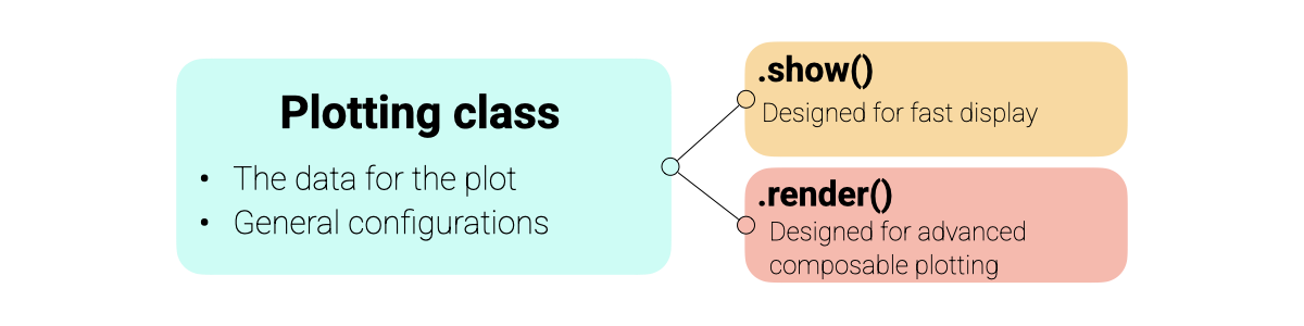
Design Philosophy#
The plotting module is built around a consistent Display Protocol designed to balance ease of use with flexibility.
Object-Oriented: Each plot type (e.g.,
SpectraPlot,ScoresPlot) is a class that holds your data and configuration.Two Modes of Operation:
show(): Creates a new figure instantly. Perfect for quick exploration.render(ax): Draws the plot onto an existing matplotlib axis. Designed for building advanced, multi-panel figures and dashboards.
Matplotlib Integration: All plots return standard
matplotlib.axes.Axesobjects, allowing you to add custom annotations, lines, or styling using familiar matplotlib commands.
An overview of the plotting architecture is shown below:
Note
Since chemotools plotting is built on top of matplotlib, you can use all your favorite matplotlib commands to further customize the plots returned by render() or show().
Visualizing Spectra#
The SpectraPlot is your primary tool for exploratory data analysis. It offers flexible ways to visualize your spectral data.
For this example, we will use the fermentation dataset from chemotools.
from chemotools.datasets import load_fermentation_train
from chemotools.feature_selection import RangeCut

import numpy as np

# Load data
X, Y = load_fermentation_train()
wavenumbers = X.columns.values
y = Y["glucose"]
X = X.values

# Measuring date
measuring_date = np.array(["2023-01-01"] * 10 + ["2023-01-02"] * 11)
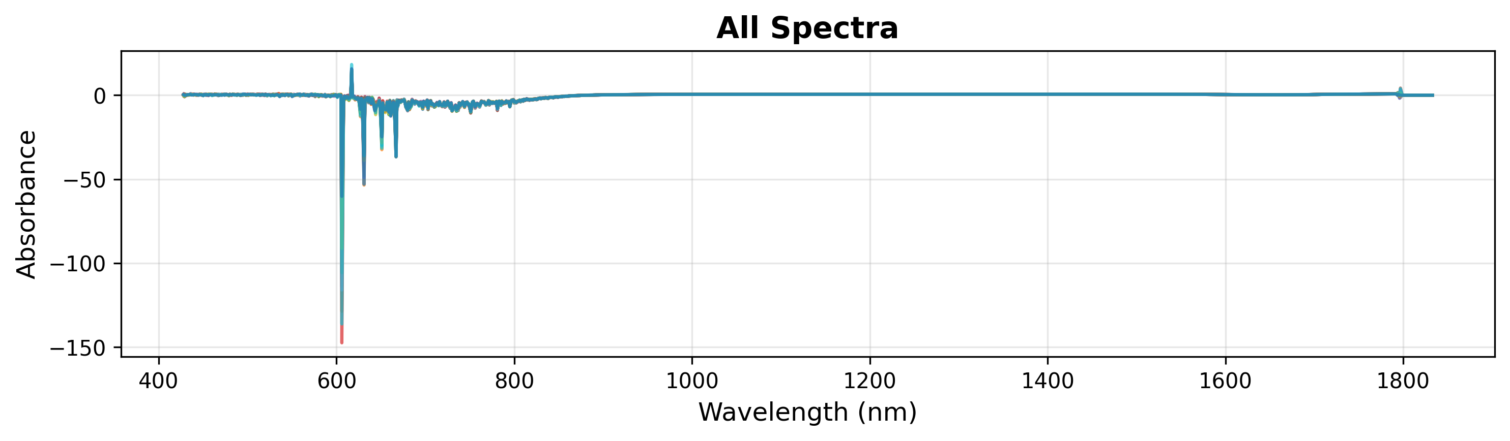
1. Quick Visualization
To quickly inspect your data, simply pass the wavenumbers and the spectra matrix. This plots all spectra in a single color.
# Create plot object
plot = SpectraPlot(x=wavenumbers, y=X)

# Display it
fig = plot.show(title="All Spectra", ylabel="Absorbance")
During exploration, you might want to inspect a specific region of the spectra. You can do this by specifying xlim in the show() method (see below).
# Display it
fig = plot.show(title="All Spectra", ylabel="Absorbance", xlim=(900, 1500))
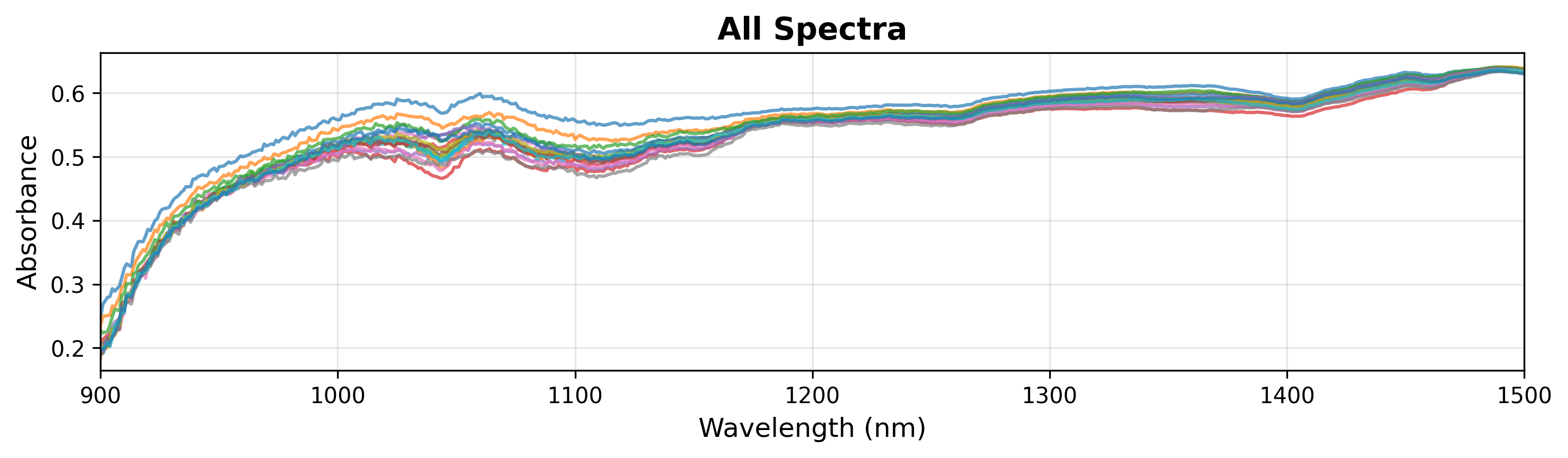
Note
The SpectraPlot automatically handles y-axis scaling based on the data range. You can also manually set ylim to focus on specific features.
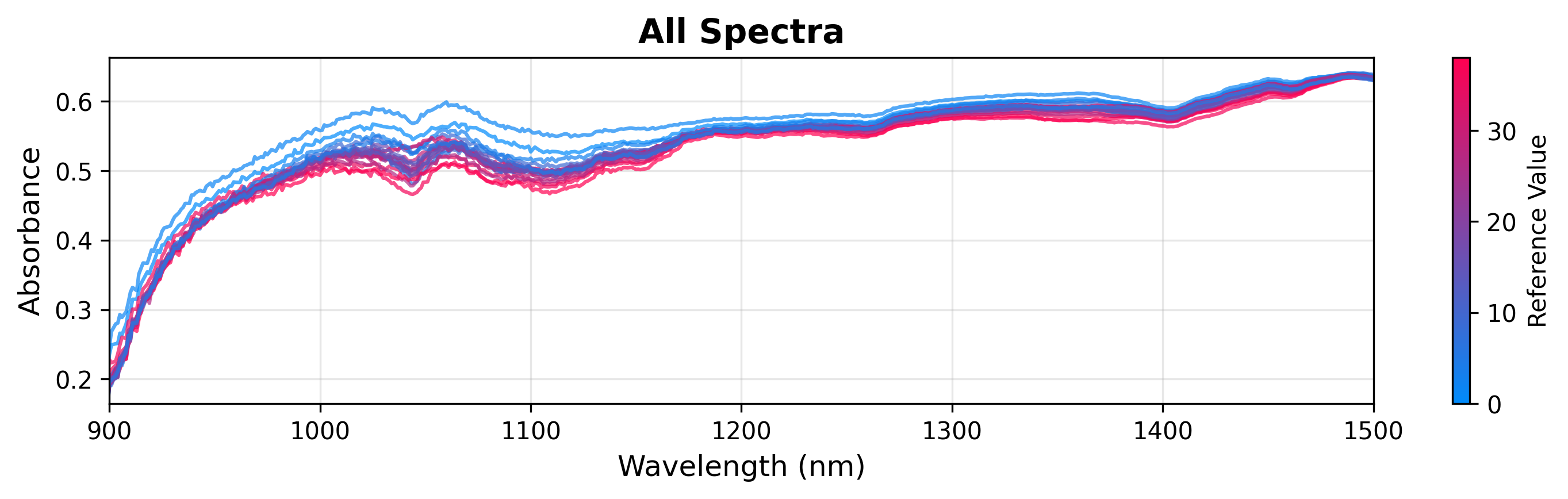
2. Coloring by Continuous Variable
You can color spectra based on a continuous target variable (like glucose concentration) to visualize correlations.
# Create plot object
plot = SpectraPlot(x=wavenumbers, y=X, color_by=y)

# Display it
fig = plot.show(title="All Spectra", ylabel="Absorbance", xlim=(900, 1500))
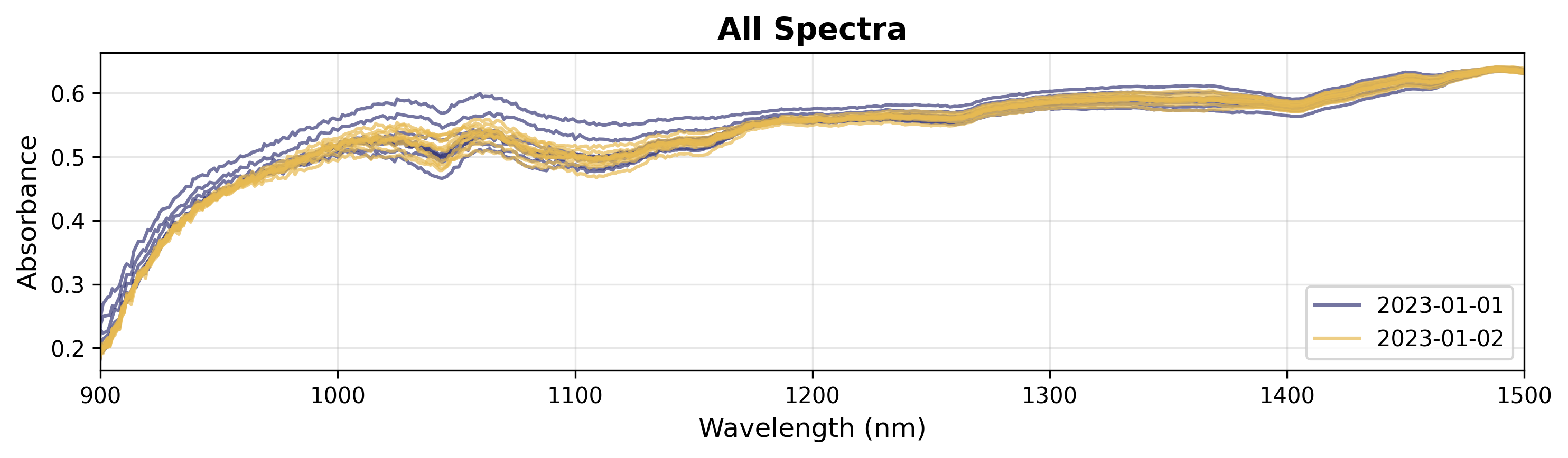
3. Coloring by Categorical Variable
If you have categorical data (e.g., batches, experimental conditions), you can color by groups.
# Create plot object
plot = SpectraPlot(x=wavenumbers, y=X, color_by=measuring_date, color_mode="categorical")

# Display it
fig = plot.show(title="All Spectra", ylabel="Absorbance", xlim=(900, 1500))
Analyzing Models#
After fitting a chemometric model (like PCA or PLS), visualizing the results is crucial for interpretation. For this section, we will use a toy PCA model fitted with the fermentation data from chemotools.
from sklearn.decomposition import PCA
import matplotlib.pyplot as plt

# Fit a PCA model
pca = PCA(n_components=3)
scores = pca.fit_transform(X)
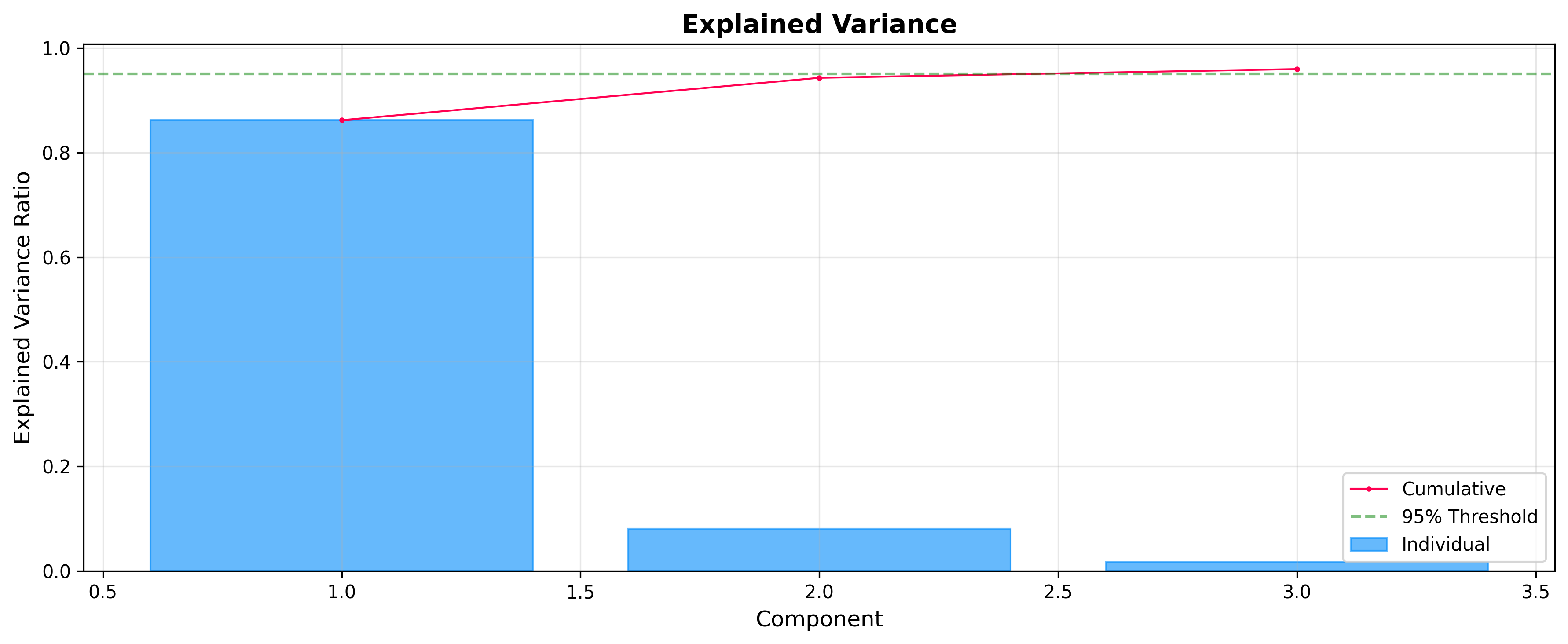
Explained Variance: Choosing Components
Before analyzing scores and loadings, it is often useful to check how much variance each component explains. The ExplainedVariancePlot helps you decide the optimal number of components.
from chemotools.plotting import ExplainedVariancePlot

# Plot explained variance ratio
plot = ExplainedVariancePlot(pca.explained_variance_ratio_)
fig = plot.show(title="Explained Variance")
Scores: The Sample Space
Use ScoresPlot to visualize how samples relate to each other. This is essential for identifying clusters, trends, or outliers. The ScoresPlot is highly flexible and can be used to create composite figures to show different aspects of your model, such as confidence ellipses and sample annotations.
from chemotools.plotting import ScoresPlot


fig, ax = plt.subplots(1, 2, figsize=(12, 5))

# 1. Simple2D scores plot colored by glucose concentration
plot = ScoresPlot(scores, components=(0, 1), color_by=y)
plot.render(ax=ax[0])
ax[0].set_title("Scores Plot")

# 2. Advanced scores plot with confidence ellipse and annotations
sample_names = [f"{i}" for i in range(len(scores))]
plot = ScoresPlot(
    scores,
    confidence_ellipse=0.9,
    annotations=sample_names,
    components=(0, 1),
    color_by=y,
)
plot.render(ax=ax[1])
ax[1].set_title("Scores Plot with Annotations")
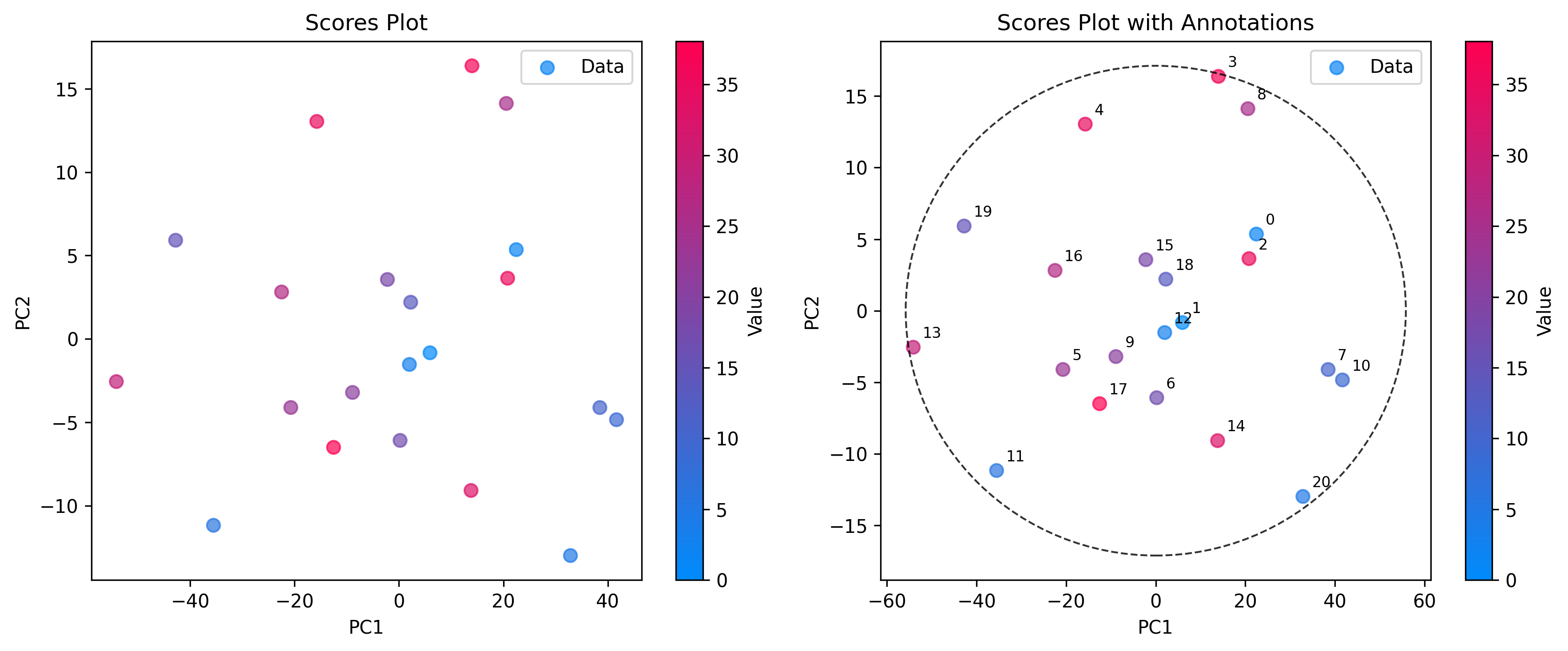
Note
Since we are composing two plots into a single figure, we used the render(ax=...) method to draw each plot onto specific axes. This allows for precise control over layout and styling.
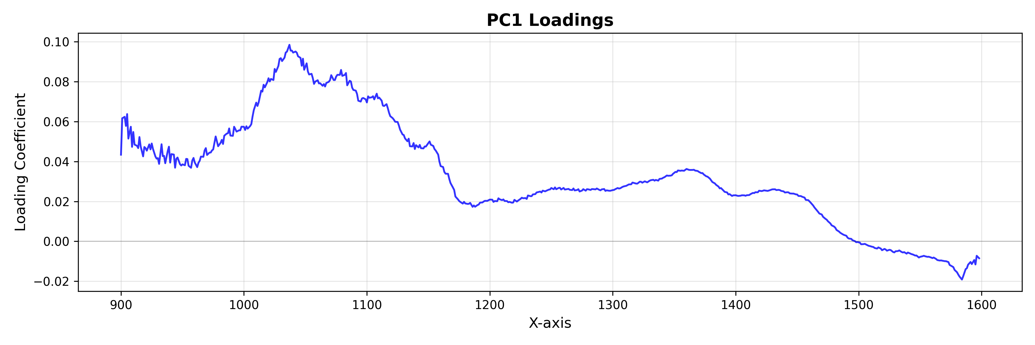
Loadings: The Feature Space
Use LoadingsPlot to understand which spectral features contribute most to the model.
from chemotools.plotting import LoadingsPlot

loadings = pca.components_.T

# Plot loadings for the first component
plot = LoadingsPlot(loadings, feature_names=wavenumbers, components=0)
fig = plot.show(title="PC1 Loadings", ylabel="Loading Coefficient")
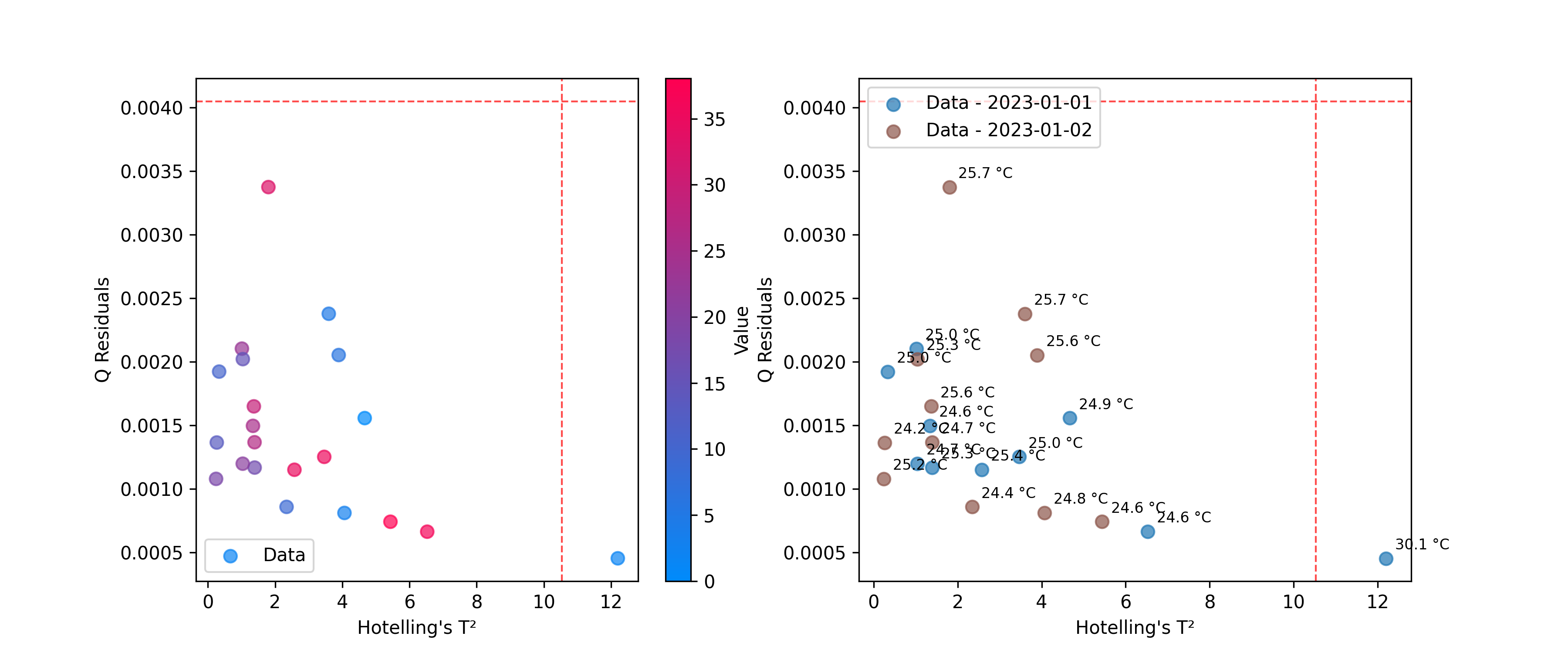
Outlier Detection
Use DistancesPlot to identify samples that don’t fit the model well, using metrics like Hotelling’s T² and Q-residuals. See Outliers for more details on calculating these statistics.
from chemotools.outliers import HotellingT2, QResiduals

# Calculate outlier statistics
hotelling = HotellingT2(pca).fit(X)
q_residuals = QResiduals(pca).fit(X)
Now, we are ready to visualize the results.
from chemotools.plotting import DistancesPlot

# Plot T² vs Q-residuals
plot = DistancesPlot(
    x=hotelling.predict_residuals(X_cut),
    y=q_residuals.predict_residuals(X_cut),
    confidence_lines=(hotelling.critical_value_, q_residuals.critical_value_),
    color_by=y,
).render(ax=ax[0],xlabel="Hotelling's T²", ylabel="Q Residuals")

plot = DistancesPlot(
    x=hotelling.predict_residuals(X_cut),
    y=q_residuals.predict_residuals(X_cut),
    confidence_lines=(hotelling.critical_value_, q_residuals.critical_value_),
    color_by=measuring_date,
    annotations=temperatures,
).render(ax=ax[1],xlabel="Hotelling's T²", ylabel="Q Residuals")
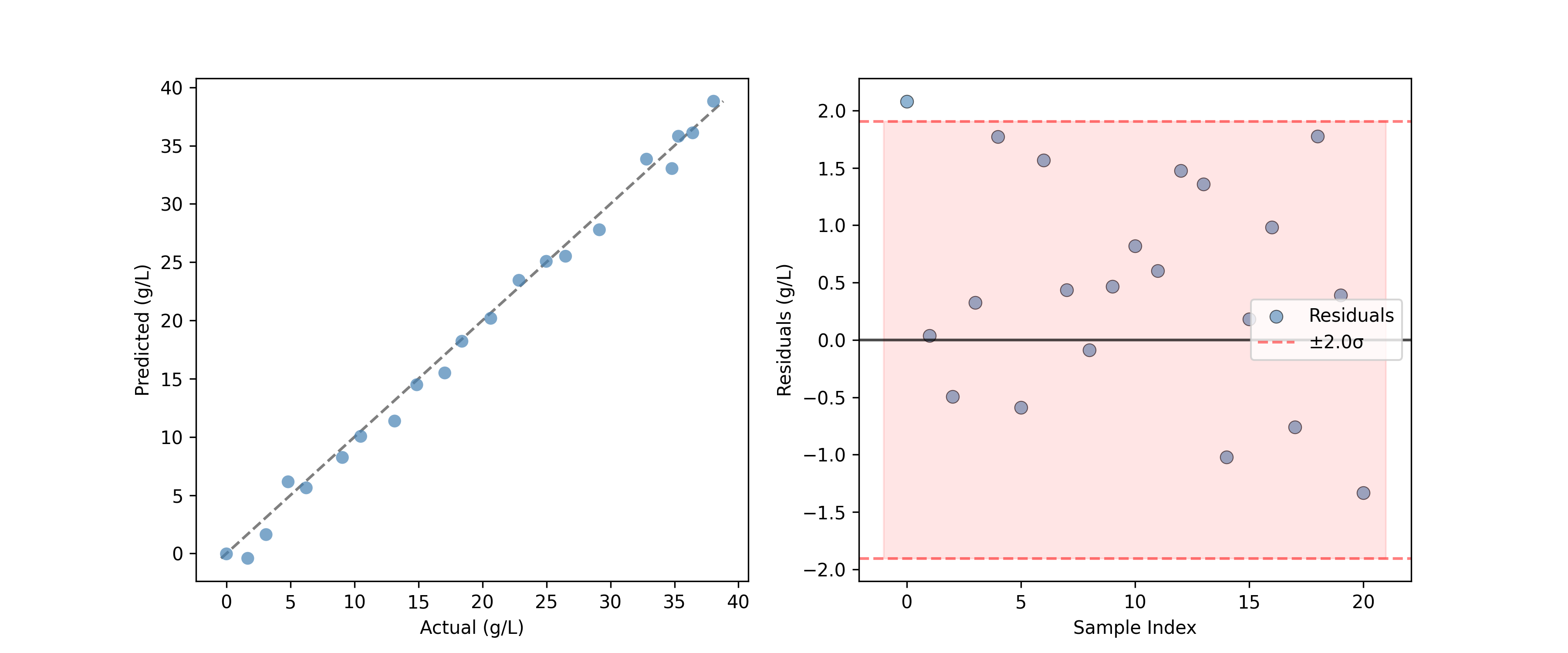
Evaluating Predictions#
For regression models, the PredictedVsActualPlot provides a standard way to assess model performance.
from chemotools.plotting import PredictedVsActualPlot, YResidualsPlot
y_residuals = y_test - y_pred

# Assume y_pred comes from a PLS model
fig, ax = plt.subplots(1, 2, figsize=(12, 5))
PredictedVsActualPlot(y_true=y_test, y_pred=y_pred).render(
    ax=ax[0], xlabel="Actual (g/L)", ylabel="Predicted (g/L)"
)
YResidualsPlot(residuals=y_residuals, add_confidence_band=True).render(
    ax=ax[1], xlabel="Sample Index", ylabel="Residuals (g/L)"
)
Creating Composite Figures#
All plotting classes support a render(ax=...) method, allowing you to place plots onto existing matplotlib axes. This is powerful for creating dashboards or comparison figures.
import matplotlib.pyplot as plt

# Create a figure with 2 subplots
fig, (ax1, ax2) = plt.subplots(1, 2, figsize=(12, 5))

# Plot 1: All spectra
SpectraPlot(x=wavenumbers, y=X, color='lightgray').render(ax1)
ax1.set_title("Raw Spectra")

# Plot 2: Mean spectrum
SpectraPlot(x=wavenumbers, y=X.mean(axis=0), color='black').render(ax2)
ax2.set_title("Mean Spectrum")

plt.tight_layout()
plt.show()
Other Available Plots#
The chemotools.plotting module includes other specialized plots not covered in this guide:
FeatureSelectionPlot: Visualize feature importance and selection results.QQPlot: Check for normality of residuals.ResidualDistributionPlot: Analyze the distribution of model residuals.YResidualsPlot: Plot residuals against predicted values.
Check the API reference for more details on these classes.