Glucose monitoring with PLS#
💡NOTE: This document is a Jupyter notebook. You can download the source file and run it in your Jupyter environment!
Introduction#
This dataset provides information on lignocellulosic ethanol fermentation through spectroscopic data collected data using attenuated total reflectance, mid-infrared (ATR-MIR) spectroscopy, along with reference measurements using high-performance liquid chromatography (HPLC) for validation.
The project contains two datasets:
Training Dataset: Contains spectral data with corresponding HPLC measurements used to train the partial least squares (PLS) models.
Testing Dataset: Includes a time series of spectra collected during fermentation, plus off-line HPLC measurements.
For more information about these datasets and how they can be used to monitor fermentation, please see our article: “Transforming Data to Information: A Parallel Hybrid Model for Real-Time State Estimation in Lignocellulosic Ethanol Fermentation.” (Note that the data in the article differs from the data provided here.)
Objective#
In this exercise, you will build a PLS model to monitor glucose concentration in real-time using ATR-MIR spectroscopy. You’ll train the model using a small training set of spiked spectra, then test its performance with spectra from an actual fermentation process.
Before starting#
Before we start, you need to be sure to have the following dependencies installed:
chemotools
matplotlib
numpy
pandas
scikit-learn
You can install them using
pip install chemotools
pip install matplotlib
pip install numpy
pip install pandas
pip install scikit-learn
Loading the training data#
You can access the from the chemotools.datasets module with the load_fermentation_train() function.
[ ]:
from chemotools.datasets import load_fermentation_train

spectra, hplc = load_fermentation_train()
The load_fermentation_train() function returns two pandas.DataFrame:
spectra: This dataframe contains spectral data, with columns representing wavenumbers and rows representing samples.hplc: Here, you’ll find reference HPLC measurements for the glucose concentration (in g/L) of each sample, stored in a single column labeledglucose.
💡NOTE: If you are interested in working with
polars.DataFrameyou can simply useload_fermentation_train(set_output="polars"). Note that if you choose to work withpolars.DataFramethe wavenumbers are given in the column names asstrand not asfloat. This is becausepolarsdoes not support column names with types other thanstr. To extract the wavenumbers asfloatfrom thepolars.DataFrameyou can use thedf.columns.to_numpy(dtype=np.float64)method.
Exploring the training data#
Before starting with data modeling, it’s important to get familiar with your data. Let’s start by answering some basic questions:
How many samples are there?
and how many wavenumbers are available?
[ ]:
print(f"Number of samples: {spectra.shape[0]}")
print(f"Number of wavenumbers: {spectra.shape[1]}")
Number of samples: 21
Number of wavenumbers: 1047
Now that we have the basics down, let’s take a closer look at the data.
For the spectral data, you can use the pandas.DataFrame.head() method to examine the first 5 rows:
[ ]:
spectra.head()
| 428.0 | 429.0 | 431.0 | 432.0 | 434.0 | 436.0 | 437.0 | 439.0 | 440.0 | 442.0 | ... | 1821.0 | 1823.0 | 1824.0 | 1825.0 | 1826.0 | 1828.0 | 1829.0 | 1830.0 | 1831.0 | 1833.0 | |
|---|---|---|---|---|---|---|---|---|---|---|---|---|---|---|---|---|---|---|---|---|---|
| 0 | 0.493506 | -0.383721 | 0.356846 | 0.205714 | 0.217082 | 0.740331 | 0.581749 | 0.106719 | 0.507973 | 0.298643 | ... | 0 | 0 | 0 | 0 | 0 | 0 | 0 | 0 | 0 | 0 |
| 1 | 0.108225 | 0.488372 | -0.037344 | 0.448571 | 0.338078 | 0.632597 | 0.368821 | 0.462451 | 0.530752 | 0.221719 | ... | 0 | 0 | 0 | 0 | 0 | 0 | 0 | 0 | 0 | 0 |
| 2 | 0.095238 | 0.790698 | 0.174274 | 0.314286 | 0.106762 | 0.560773 | 0.182510 | 0.482213 | 0.482916 | 0.341629 | ... | 0 | 0 | 0 | 0 | 0 | 0 | 0 | 0 | 0 | 0 |
| 3 | 0.666667 | 0.197674 | 0.352697 | 0.385714 | 0.405694 | 0.508287 | 0.463878 | 0.430830 | 0.455581 | 0.527149 | ... | 0 | 0 | 0 | 0 | 0 | 0 | 0 | 0 | 0 | 0 |
| 4 | 0.532468 | -0.255814 | 0.078838 | 0.057143 | 0.238434 | 0.997238 | 0.399240 | 0.201581 | 0.533030 | 0.246606 | ... | 0 | 0 | 0 | 0 | 0 | 0 | 0 | 0 | 0 | 0 |
5 rows × 1047 columns
For brevity, we won’t display the entire table here, but you’ll notice that each column corresponds to a wavenumber, and each row represents a sample.
Turning to the HPLC data, the pandas.DataFrame.describe() method provides a summary of the glucose column:
[ ]:
hplc.describe()
| glucose | |
|---|---|
| count | 21.000000 |
| mean | 19.063895 |
| std | 12.431570 |
| min | 0.000000 |
| 25% | 9.057189 |
| 50% | 18.395220 |
| 75% | 29.135105 |
| max | 38.053004 |
This summary offers insights into the distribution of the glucose concentration. With this practical knowledge, we are now ready to continue with our data modeling journey.
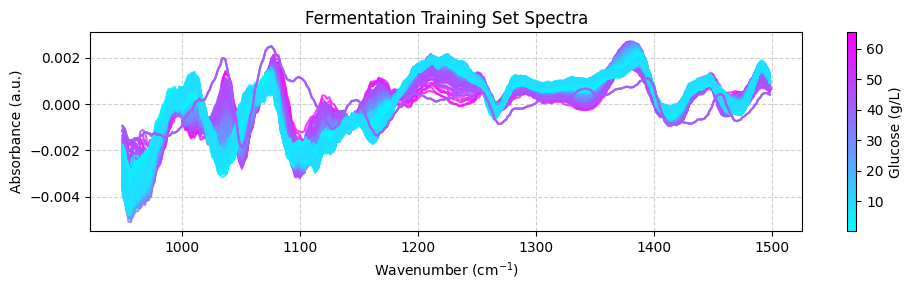
Visualizing the training data#
To better understand our dataset, we will visualize the data. We will plot the spectra in the train dataset, with each spectrum color-coded to reflect its associated glucose concentration. This visual approach provides a didactic means to understand the dataset’s characteristics, offering insights into chemical variations among the samples. To do so, we’ll use the matplotlib.pyplot module. Remember to install it first using:
pip install matplotlib
Up until now, we have used pandas.DataFrame to represent the dataset. pandas.DataFrame are great for storing and manipulating many large datasets. However, I often find more convenient to use numpy.ndarray to work with spectral data. Therefore, we will convert the pandas.DataFrame to numpy.ndarray using the pandas.DataFrame.to_numpy() method.
So our first step will be to transform our pandas.DataFrame to numpy.ndarray:
[ ]:
import numpy as np

# Convert the spectra pandas.DataFrame to numpy.ndarray
spectra_np = spectra.to_numpy()

# Convert the wavenumbers pandas.columns to numpy.ndarray
wavenumbers = spectra.columns.to_numpy(dtype=np.float64)

# Convert the hplc pandas.DataFrame to numpy.ndarray
hplc_np = hplc.to_numpy()
Before plotting our data, we’ll create a dedicated plotting function that color-codes each spectrum according to its glucose concentration. This approach helps visualize the relationship between spectral patterns and glucose levels.
The function will implement:
Color normalization: We’ll use
matplotlib.colors.Normalizeto scale glucose concentration values to a 0-1 range, making them suitable for color mapping.Color mapping: The normalized values will be mapped to colors using a color map via
matplotlib.cm.ScalarMappable.Colorbar: We’ll add a colorbar to indicate how colors correspond to glucose concentration values.
This visualization allows us to compare multiple spectra based on their associated glucose concentrations.
[ ]:
import matplotlib.pyplot as plt
from matplotlib.colors import Normalize
import numpy as np

def plot_spectra(spectra: np.ndarray, wavenumbers: np.ndarray, hplc: np.ndarray, zoom_in=False):
    """
    Plot spectra with colors based on glucose concentration.

    Parameters:
    -----------
    spectra : np.ndarray
        Array containing spectral data, where each row is a spectrum
    wavenumbers : np.ndarray
        Array of wavenumbers (x-axis values)
    hplc : np.ndarray
        Array of glucose concentrations corresponding to each spectrum
    zoom_in : bool, default=False
        If True, zooms into a specific region of interest (950-1550 cm⁻¹)

    Returns:
    --------
    None
        Displays the plot
    """
    # Create figure and axis
    fig, ax = plt.subplots(figsize=(10, 3))

    # Set up color mapping
    cmap = plt.get_cmap("cool")  # Cool colormap (purple to blue)
    normalize = Normalize(vmin=hplc.min(), vmax=hplc.max())

    # Plot each spectrum with appropriate color
    for i, spectrum in enumerate(spectra):
        color = cmap(normalize(hplc[i]))
        ax.plot(wavenumbers, spectrum, color=color, linewidth=1.5, alpha=0.8)

    # Add colorbar to show glucose concentration scale
    sm = plt.cm.ScalarMappable(cmap=cmap, norm=normalize)
    sm.set_array([])
    fig.colorbar(sm, ax=ax, label='Glucose (g/L)')

    # Set axis labels and title
    ax.set_xlabel('Wavenumber (cm$^{-1}$)')
    ax.set_ylabel('Absorbance (a.u.)')
    ax.set_title('Fermentation Training Set Spectra')

    # Apply zoom if requested
    if zoom_in:
        ax.set_xlim(950, 1550)
        ax.set_ylim(0.45, 0.65)
        ax.set_title('Fermentation Training Set Spectra (Zoomed Region)')

    # Improve appearance
    ax.grid(True, linestyle='--', alpha=0.6)
    fig.tight_layout()

    # Show the plot
    plt.show()
We can now use this function to plot the training dataset:
[ ]:
plot_spectra(spectra_np, wavenumbers, hplc_np)
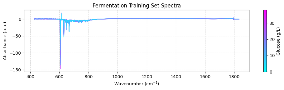
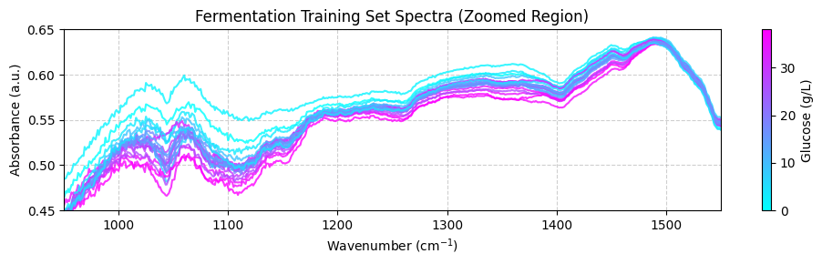
These spectra may look unclear because they cover a wide wavenumber range that includes areas with little chemical information. To get a better view, we should focus on the “fingerprint” region between 950 and 1550 cm-1, where the important chemical features appear. For now, we’ll use the zoom_in=True parameter in our plot_spectra() function to focus on this region. Later, we’ll learn how to properly trim the spectra using preprocessing functions.
[ ]:
plot_spectra(spectra_np, wavenumbers, hplc_np, zoom_in=True)
Preprocessing the training data#
Now that you’ve explored the dataset, it’s time to preprocess the spectral data. This step is essential for removing unwanted variations, such as baseline shifts and noise, which can negatively impact model performance. We’ll use the chemotools and the scikit-learn modules to preprocess the spectral data.
We will preprocess the spectra using the following steps:
Range Cut: to remove the wavenumbers outside the range between 950 and 1550 cm-1.
Linear Correction: to remove the linear baseline shift.
Savitzky-Golay: calculates the nth order derivative of the spectra using the Savitzky-Golay method. This is useful to remove additive and multiplicative scatter effects.
Standard Scaler: to scale the spectra to zero mean.
We will chain the preprocessing steps using the `make_pipeline() <https://scikit-learn.org/stable/modules/generated/sklearn.pipeline.make_pipeline.html>`__ function from scikit-learn.
💡 NOTE: What is a pipeline? A pipeline is a sequence of steps that are executed in a specific order. In our case, we will create a pipeline that will execute the preprocessing steps in the order described above. You can find more information on working with pipelines at our documentation page.
[ ]:
from chemotools.feature_selection import RangeCut
from chemotools.baseline import LinearCorrection
from chemotools.derivative import SavitzkyGolay

from sklearn.preprocessing import StandardScaler
from sklearn.pipeline import make_pipeline

# create a pipeline that scales the data
preprocessing = make_pipeline(
    RangeCut(start=950, end=1500, wavenumbers=wavenumbers),
    LinearCorrection(),
    SavitzkyGolay(window_size=15, polynomial_order=2, derivate_order=1),
    StandardScaler(with_std=False)
)
Now we can use the preprocessing pipeline to preprocess the spectra:
[ ]:
spectra_preprocessed = preprocessing.fit_transform(spectra_np)
And we can use the plot_spectra() function to plot the preprocessed spectra:
[ ]:
# get the wavenumbers after the range cut
wavenumbers_cut = preprocessing.named_steps['rangecut'].wavenumbers_


# plot the preprocessed spectra
plot_spectra(spectra_preprocessed, wavenumbers_cut, hplc_np)
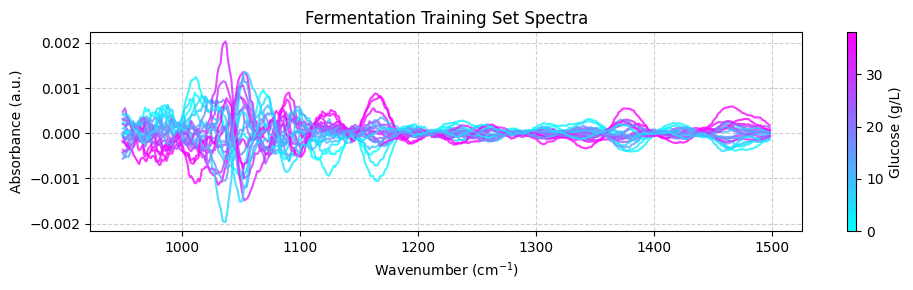
💡 NOTE: This is cool! See how we are integrating chemometrics with scikit-learn?
RangeCutLinearCorrectionandSavitizkyGolayare all preprocessing techniques implemented inchemotoolswhileStandardScalerandpipelinesare functionalities provided byscikit-learnThis is the power ofchemotools— it is designed to work seamlessly withscikit-learn
Training a PLS model#
Partial Least Squares (PLS) is a powerful regression technique commonly used in chemometrics. It works by finding a latent space representation that maximizes covariance with the target variable.
A critical parameter in PLS modeling is the number of components (dimensions) in the latent space:
Too many components leads to overfitting, where the model captures noise rather than signal
Too few components results in underfitting, missing important patterns in the data
When working with limited samples, cross-validation provides a reliable method for selecting the optimal number of components. This approach:
Divides the data into training and validation sets
Trains the model on the training set and evaluates it on the validation set
Repeats this process with different data splits
Averages the results to estimate the model’s generalization error
For our analysis, we’ll use scikit-learn’s GridSearchCV class to systematically test different component numbers through cross-validation. This will identify the optimal complexity for our PLS model based on performance metrics across multiple data splits.
[ ]:
# import the PLSRegression and GridSearchCV classes
from sklearn.cross_decomposition import PLSRegression
from sklearn.model_selection import GridSearchCV

# instanciate a PLSRegression object
pls = PLSRegression(scale=False)

# define the parameter grid (number of components to evaluate)
param_grid = {'n_components': [1, 2, 3, 4, 5, 6, 7, 8, 9, 10]}

# create a grid search object
grid_search = GridSearchCV(pls, param_grid, cv=10, scoring='neg_mean_absolute_error')

# fit the grid search object to the data
grid_search.fit(spectra_preprocessed, hplc_np)

# print the best parameters and score
print("Best parameters: ", grid_search.best_params_)
print("Best score: ", np.abs(grid_search.best_score_))
Best parameters:  {'n_components': 6}
Best score:  0.922944026246299
Suggesting that the optimal number of components is 6, with a mean absolute error of 0.92 g/L. We can verify this by plotting the mean absolute error as a function of the number of components:
[ ]:
fig, ax = plt.subplots(figsize=(10, 3))
ax.plot(param_grid['n_components'], np.abs(grid_search.cv_results_['mean_test_score']), marker='o', color='b')
ax.set_xlabel('Number of components')
ax.set_ylabel('Mean absolute error (g/L)')
ax.set_title('Cross validation results')
ax.grid(True, linestyle='--', alpha=0.6)
fig.tight_layout()
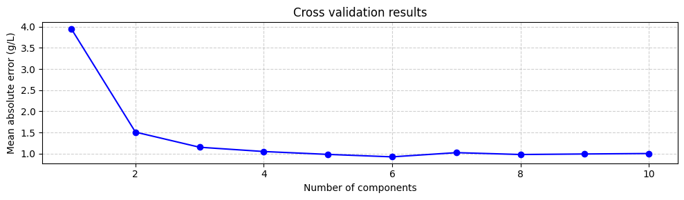
Even though using the number of components that minimize the mean absolute error is a good starting point, it is not always the best. The model with 6 components does not increase the mean absolute error much compared to the model with 3 or even two components. However, the model with 6 components includes components associated with small eigenvalues, which are more uncertain. This means that models with 3 or 2 components might be more robust. Therefore, it is always a good idea to try different numbers of components and select the one that gives the best performance. However, for now we will train the model with 6 components:
[ ]:
# instanciate a PLSRegression object with 6 components
pls = PLSRegression(n_components=6, scale=False)

# fit the model to the data
pls.fit(spectra_preprocessed, hplc_np)
PLSRegression(n_components=6, scale=False)In a Jupyter environment, please rerun this cell to show the HTML representation or trust the notebook.
On GitHub, the HTML representation is unable to render, please try loading this page with nbviewer.org.
PLSRegression(n_components=6, scale=False)
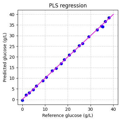
Finally we can evaluate the performance of the model on the training set:
[ ]:
# predict the glucose concentrations
hplc_pred = pls.predict(spectra_preprocessed)

# plot the predictions
fig, ax = plt.subplots(figsize=(4, 4))
ax.scatter(hplc_np, hplc_pred, color='blue')
ax.plot([0, 40], [0, 40], color='magenta')
ax.set_xlabel('Reference glucose (g/L)')
ax.set_ylabel('Predicted glucose (g/L)')
ax.set_title('PLS regression')
ax.grid(True, linestyle='--', alpha=0.6)
fig.tight_layout()
plt.show()
Applying the model#
Now that we have trained our model, we can apply it to the testing dataset. The testing dataset contains spectra recorded in real-time during the fermentation process. The test dataset contains two pandas.DataFrame:
spectra: This dataset contains spectral data, with columns representing wavenumbers and rows representing samples. These spectra were recorded in real-time during the fermentation process approximately every 1.5 minutes.hplc: This dataset contains HPLC measurements, specifically glucose concentrations (in g/L), stored in a single column labeledglucose. These measurements were recorded off-line approximately every 60 minutes.
We will use the load_fermentation_test() function from the chemotools.datasets module to load the testing dataset:
[ ]:
from chemotools.datasets import load_fermentation_test

spectra_test, hplc_test = load_fermentation_test()
Then, we will preprocess the spectra using the same preprocessing pipeline that we used for the training dataset:
[ ]:
# convert the spectra pandas.DataFrame to numpy.ndarray
spectra_test_np = spectra_test.to_numpy()

# preprocess the spectra
spectra_test_preprocessed = preprocessing.transform(spectra_test_np)
Finally, we can use the PLS model to predict the glucose concentrations:
[ ]:
# predict the glucose concentrations
glucose_test_pred = pls.predict(spectra_test_preprocessed)
We can use the predicted values to plot the spectra color-coded according to the predicted glucose concentrations:
[ ]:
plot_spectra(spectra_test_preprocessed, wavenumbers_cut, glucose_test_pred)
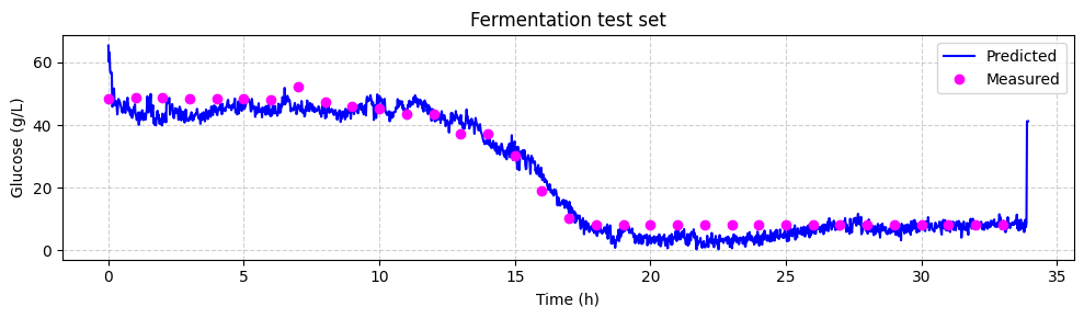
Now we can compare the predicted glucose concentrations with the off-line HPLC measurements. We will plot the predictions and the off-line measurements over time. Each spectrum was taken every 1.25 minutes, while the off-line measurements were taken every 60 minutes.
[ ]:
# make linspace of length of predictoins
time = np.linspace(0, len(glucose_test_pred), len(glucose_test_pred),) * 1.25 / 60

# plot the predictions
fig, ax = plt.subplots(figsize=(10, 3))

ax.plot(time, glucose_test_pred,  color='blue', label='Predicted')
ax.plot(hplc_test.index, hplc_test['glucose']+4, 'o', color='fuchsia', label='Measured')
ax.set_xlabel('Time (h)')
ax.set_ylabel('Glucose (g/L)')
ax.set_title('Fermentation test set')
ax.legend()
ax.grid(True, linestyle='--', alpha=0.6)
fig.tight_layout()
plt.show()
Recap#
In this tutorial, we embarked on a journey into the realm of machine learning for spectroscopic data analysis, focusing on the Fermentation dataset. We covered essential steps in building a regression model to predict glucose concentrations during lignocellulosic ethanol fermentation. Here’s a brief recap of what we accomplished:
Introduction: We introduced the Fermentation dataset, which consists of spectral data obtained through attenuated total reflectance, mid-infrared spectroscopy (ATR-MIR), and HPLC reference data. We highlighted the importance of this dataset in understanding real-time fermentation processes.
Loading and Exploring Data: We loaded the training dataset, explored its dimensions, and gained insights into both spectral and HPLC data. Understanding your data is a crucial first step in any data analysis project.
Visualizing Data: We used data visualization to gain a deeper understanding of the dataset. By plotting the spectra color-coded by glucose concentration, we visually examined the chemical variations among samples.
Preprocessing Data: We applied preprocessing techniques, such as range cutting, linear correction, Savitzky-Golay derivative, and standard scaling, to prepare the spectral data for modeling. This step removed unwanted variations and enhanced the data’s quality.
Model Training: We trained a Partial Least Squares (PLS) regression model to predict glucose concentrations. We used cross-validation to find the optimal number of components and assessed model performance.
Application to Testing Data: We extended our model to predict glucose concentrations in real-time by applying it to the testing dataset. This allowed us to monitor glucose levels during fermentation.
This tutorial provides a solid foundation for anyone interested in using machine learning techniques for spectroscopic data analysis. By following these steps, you can gain valuable insights from complex spectral data and make predictions that can be applied in real-world applications. Happy analyzing!